- Introduction
- How do I Use The Material UI Select React Component?
- Material UI Select Options
- How do you use the dropdown in MUI?
- React Material UI Select onChange Typing
- MUI Select Label and Helper Text
- MUI Select Placeholder and Default Value
- React Material UI Select Standard Variant
- React Select MUI Filled Variant
- React Select MUI Outlined Variant
- React Select MUI Auto Width
- How do I Make MUI Select Required?
- How do I Make MUI Select Disabled?
- Handling Errors With React Select MUI
- MUI MultiSelect
- MUI React Select Options Grouping
- Accessibility
- Recommended Resources
- Conclusion
- More Interesting Reads From Our Blog
- Easily Convert Figma Design to Code
Introduction
MUI provides more than enough available styled components to assist developers in making their designs more artistic and pleasing. One of these available styled components is the Material UI Select. It is an input that comes with configurable props that allow a user to collect information from a list of options that have been provided. With this component, we can create React dropdowns and also customize them.
In this article, you’ll learn about the MUI Select and how we can customize the ReactSelectMUI props. Also, we will learn how to create a single select and multiple select dropdowns in React.
How do I Use The Material UI Select React Component?
To use this component, you need to add MUI to your React Project by running the following commands:
npm
1 | npm install @mui/material @emotion/react @emotion/styled |
yarn
1 | yarn add @mui/material @emotion/react @emotion/styled |
After installation, you can proceed to use the React Select component in your project by importing Select as shown below:
1 | import { Select } from '@material-ui/core'; |
Material UI Select Options
The menu items in a Select component are also referred to as Options. They can be rendered dynamically from an array of string values and a placeholder value is permanently added to the dropdown list. You can add a placeholder Option with no value as shown in the example below:
1 2 3 | <MenuItem disabled value=""> None</MenuItem> |
If you prefer not to have a disabled value in the dropdown, it is recommended that you use the placeholder text with renderValue which is only seen in the input field until a value is selected.
How do you use the dropdown in MUI?
You can use the dropdown in MUI by creating menu items with the React Select components with customizable options of your choice. See the following code:
1 2 3 4 5 6 7 8 9 10 11 12 13 14 15 16 17 18 19 20 21 | import React from 'react';import {Select, MenuItem} from "@mui/material";function App =()=> { return ( <Select sx={{ marginTop:35, width: 250, height: 50, }} > <MenuItem value={1}>Red</MenuItem> <MenuItem value={2}>Black</MenuItem> <MenuItem value={3}>Blue</MenuItem> <MenuItem value={4}>Green</MenuItem> <MenuItem value={5}>Yellow</MenuItem> </Select>)}export default App; |
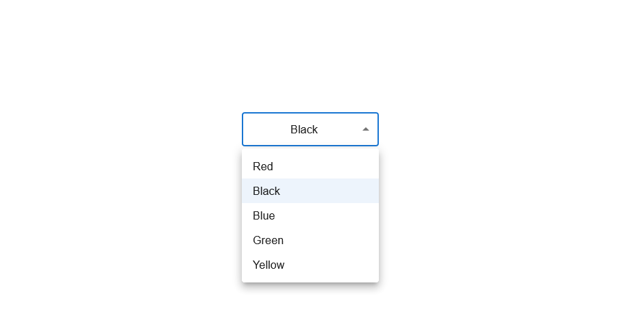
The example above shows an MUI single select component of colors with selectable options and a single value of black as its selected value. The value property helps define what option was selected. Here is the result in the image below:
React Material UI Select onChange Typing
One of the props accepted in the React Select MUI is the onChange event. It is a callback function called or triggered when an option is changed. When we want to make the input field editable or when we want to change values easily we use the onChange event with the value by setting the state.
In this example, we are building a Select component that has a dropdown of Color options. We are creating a Single select component that accepts a string value as shown below:
1 2 3 4 5 6 7 8 9 10 11 12 13 14 15 16 17 18 19 20 21 22 23 24 25 26 27 28 29 30 31 32 | import React from 'react';import { Select, MenuItem } from "@mui/material";import { useState } from "react";function App() { const [color, setColor] = useState(""); const handleChange = (event) => { setColor(event.target.value); }; return ( <div className="App"> <Select value={color} onChange={handleChange} sx={{ marginTop: 35, width: 250, height: 50, }} > <MenuItem value={1}>Red</MenuItem> <MenuItem value={2}>Black</MenuItem> <MenuItem value={3}>Blue</MenuItem> <MenuItem value={4}>Green</MenuItem> <MenuItem value={5}>Yellow</MenuItem> </Select> </div> );}export default App; |
MUI Select Label and Helper Text
The MUI Select component is like an Input component with a Menu dropdown. However, we can add a React component Label, and Helper Text manually.
See the following code:
1 2 3 4 5 6 7 8 9 10 11 12 13 14 15 16 17 18 19 | import React from 'react';import {Select, MenuItem} from "@mui/material";function App =()=> {return (<div className="App"><FormControl sx={{marginTop:35,width: 200}}><InputLabel id="simple-select-label">Color</InputLabel> <Select label={color ? "Color" : ""}/> <FormHelperText>Select a color</FormHelperText></FormControl></div>)export default App;} |
The InputLabel and the FormHelperText are rendered inside a FormControl so that they can have the appropriate positioning that we see in the MUI documentation. Both the InputLabel and the FormHelperText are required because the InputLabel provides the text and the label prop helps notify the component that there will be a label. The FormHelperText is also usually beneath the Select with a message displayed as shown below:
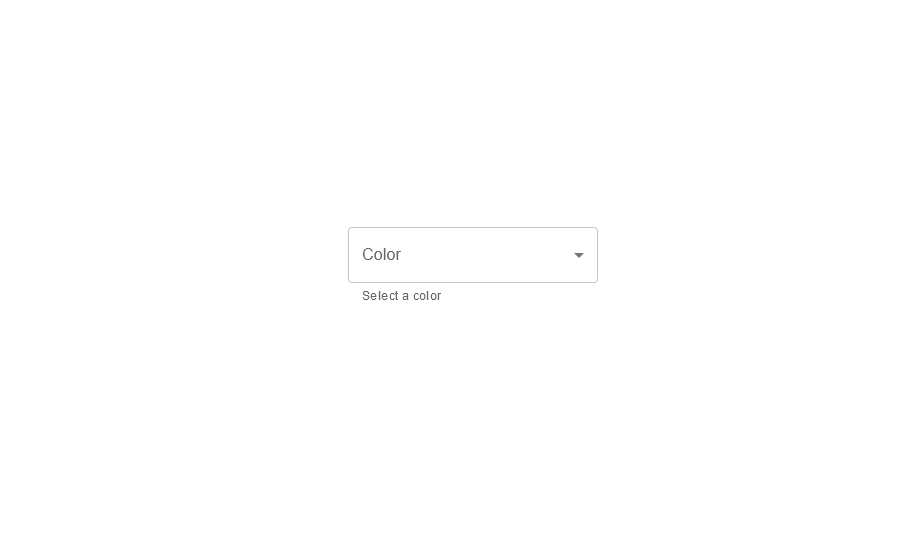
The text in the input field is the InputLabel and the message displayed beneath it is the FormHelperText.
MUI Select Placeholder and Default Value
Let’s assume you want a React Select MUI component with a placeholder that will not be displayed in the options list instead of having to make the first option the placeholder by making its value none.
Placeholder and default value are quite alike. The placeholder is usually an explanatory text displayed and may have unique styling. A default value is said to be an already selected value from the list that is functional. See the following example of how to input a default value in a state prop:
1 | const [color, setColor] = useState('Red'); |
With the above code, “red” will be rendered as the input value, and any components or functionality depending on the color, the state will know that it has a value. If we try to input a default value that is n0t in the options list, like say we set the default value to “pink”, it becomes the selected value. Here is an image of what it will look like:
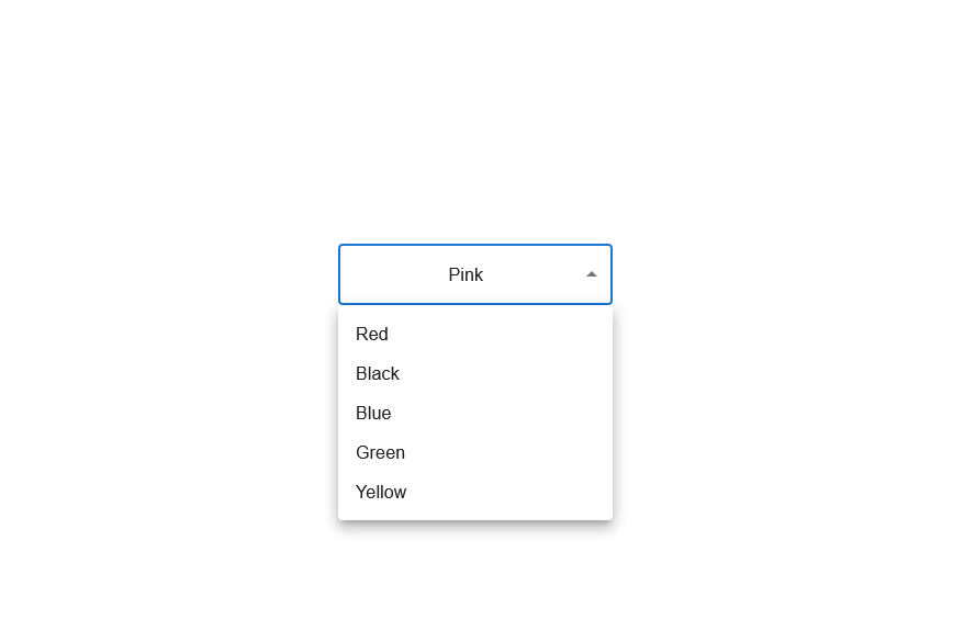
The placeholder text requires more code. The React Select component provides a prop called the renderValue that allows us to customize how value and input value are rendered. It can render either a text or an element. See the code below:
1 2 3 | const [color, setColor] = useState('');renderValue={(value) => value ? value : "None"} |
If a selected value exists, a code is added that examines the value of the Select component and renders it but if it does not exist there will be a “None” text displayed. The only time that nothing is selected when rendered is if an empty string is set as the value of the state.
If you use a Label, you will need to render it only when the component has a value. Otherwise, it will result in an overlap:
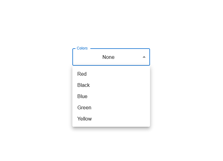
React Material UI Select Standard Variant
The Variant is a React Select MUI prop. It is one of many ways we can customize our MUI component. To get the Standard variant, see the following code:
1 2 3 4 5 6 7 8 9 10 11 12 13 14 | <FormControl variant="standard"sx={{ marginTop: 35, width: 100 }}> <InputLabel shrink>Colors</InputLabel> <Select label="Colors" value={color} onChange={handleChange}> <MenuItem value={1}>Red</MenuItem> <MenuItem value={2}>Black</MenuItem> <MenuItem value={3}>Blue</MenuItem> <MenuItem value={4}>Green</MenuItem> <MenuItem value={5}>Yellow</MenuItem> </Select> <FormHelperText>Select a color</FormHelperText></FormControl> |
React Select MUI Filled Variant
Another way of customizing our component is by using the Filled variant, all you need to do is change the Standard to Filled. See the code below:
1 2 3 4 5 6 7 8 9 10 11 12 13 14 | <FormControl variant="filled"sx={{ marginTop: 35, width: 100 }}> <InputLabel shrink>Colors</InputLabel> <Select label="Colors" value={color} onChange={handleChange}> <MenuItem value={1}>Red</MenuItem> <MenuItem value={2}>Black</MenuItem> <MenuItem value={3}>Blue</MenuItem> <MenuItem value={4}>Green</MenuItem> <MenuItem value={5}>Yellow</MenuItem> </Select> <FormHelperText>Select a color</FormHelperText></FormControl> |
React Select MUI Outlined Variant
We can do the same for the Outlined variant by changing the Filled to Outlined as shown below:
1 2 3 4 5 6 7 8 9 10 11 12 13 14 | <FormControl variant="outlined"sx={{ marginTop: 35, width: 100 }}> <InputLabel shrink>Colors</InputLabel> <Select label="Colors" value={color} onChange={handleChange}> <MenuItem value={1}>Red</MenuItem> <MenuItem value={2}>Black</MenuItem> <MenuItem value={3}>Blue</MenuItem> <MenuItem value={4}>Green</MenuItem> <MenuItem value={5}>Yellow</MenuItem> </Select> <FormHelperText>Select a color</FormHelperText></FormControl> |
React Select MUI Auto Width
The React Select width component of the dropdown box can be customized according to its menu items. This is done by setting it in the FormControl using the MUI Select width component props defined as:
1 | <FormControl autoWidth >...</FormControl> |
See the image below:
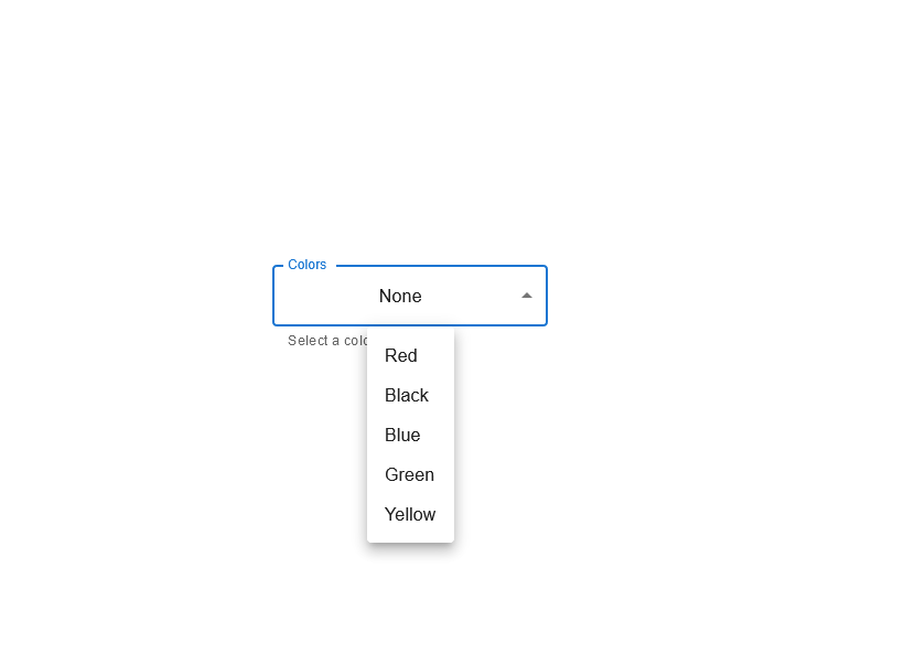
In the above image, the width of the dropdown box was reduced to fit the content of its menu items.
How do I Make MUI Select Required?
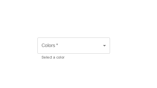
React props helps create read-only attributes between React components. The MUI Select Required is a React Select component-based prop. To make the MUI Select input Required, we can set that in the FormControl using the props defined as:
1 | <FormControl required >...<FormControl/> |
See the image below:
How do I Make MUI Select Disabled?
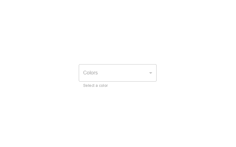
We can do the same for the MUI Select Disabled by changing the FormControl using the props defined as:
1 | <FormControl disabled >...<FormControl/> |
See the image below:
Handling Errors With React Select MUI
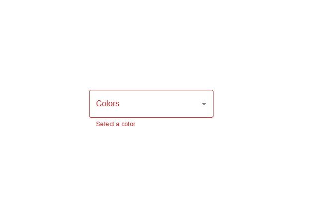
The React Select MUI component accepts Error as a prop that can be used by changing the props in the FormControl as shown:
1 | <FormControl error >...</FormControl> |
See the image below:
MUI MultiSelect
We can configure the MUI React Select component to handle selecting multiple values based on the options provided in menu items by using the Multiple props. We can do that by changing the state to hold an array of items. Let’s take a look at the following code by selecting multiple values or by selecting multiple HTML colors:
1 2 3 4 5 6 7 8 9 10 11 12 13 14 15 16 17 18 19 20 21 22 23 24 25 26 27 28 29 30 31 32 33 34 35 36 37 38 39 40 41 42 43 44 | import { Select, MenuItem, FormHelperText, FormControl, InputLabel } from '@material-ui';import React, { useState } from 'react';function App() { const [color, setColor] = useState([]); const colorData = [Red, Black, Green, Blue, Yellow] const handleChange= (event) => { setColor(event.target.value); }; return (<FormControl sx ={{ marginTop: 35, width: 250, height: 50,}}>{color ? <InputLabel id="simple-select-label">Colors</InputLabel> : ""}<SelectlabelId="simple-select-label"label:"Colors"multiplevalue={color}onChange={handleChange}display>// Looping through the array{colorData.map((value) => {return <MenuItem value={colorValue}>{colorValue}</MenuItem>;})}</Select><FormHelperText>Select a color</FormHelperText></FormControl> );}export default App; |
In the above code, we stored the state in an empty array, then we created an array of data that we looped through to create themenu items that will allow usto select multiple colors component. See the result below:

In the above image, we can see the React Select menu items displayed with the options “red” and “black” simultaneously being the selected value. In the multiple select, you can select new values without it replacing your previously selected value.
MUI React Select Options Grouping
Options grouping is a way of customizing options in groups based on the conditions set. Additionally, the React MUI Select components make customizing the options easy. It can also be used in a single select or multiple select dropdowns. Look at the following code:
1 2 3 4 5 6 7 8 9 10 11 12 13 14 15 16 17 18 19 20 21 22 23 24 25 26 27 28 29 30 31 32 33 34 35 36 37 38 39 40 41 42 43 44 45 46 47 48 49 50 51 | import {FormControl, TextField} from "@mui/material";import {Autocomplete} from "@material-ui/lab/Autocomplete";const App = () => { const colorData = [ { color: "Red" }, { color: "Green" }, { color: "Blue" }, { color: "Black" }, { color: "Yellow" }, ]; const options = colorData.map((value) => { //Grouping the colors by their first letter const firstLetter = value.color[0].toUpperCase(); return { firstLetter: /[0-9]/.test(firstLetter) ? "0-9" : firstLetter, ...value, }; }); return ( <FormControl sx={{ marginTop: 35, width: 250, marginLeft: 70 }}> <Autocomplete options={options.sort( (a, b) => -b.firstLetter.localeCompare(a.firstLetter) )} groupBy={(option) => option.firstLetter} getOptionLabel={(option) => option.color} renderInput={(value) => ( <TextField {...value} label="Colors Demo" /> )} /> </FormControl> );};export default App; |
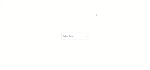
In the code above, we created an array list of colors and separated the options into groups of first-letter. Then we used the Autocomplete component which is a text input that complements a list of options. See the below image for the result:
Accessibility
The Label component helps to properly set the prop label and adequately tag your Select value. To do that, you will need another element with an id that contains a label. The id assigned to that element must match the labelId of the Select components. Here is an example:
1 2 3 4 5 | <InputLabel id = "label">Color</InputLabel><Select labelId="label" id="select" value={1}> <MenuItem value={1}>Red</MenuItem> <MenuItem value={2}>Green</MenuItem></Select> |
Recommended Resources
Conclusion
In this article, we learned how to use the React MUI Select component to create customizable dropdowns that collect user-provided data from a list of options. We also learned about some of the various props accepted by the component and their use cases.
Finally, we saw how to create a single-select and multiple-select dropdown, how we can add new values to already selected values in the multiple-select dropdown, and how to group our user-provided options list in a dropdown.
More Interesting Reads From Our Blog
- A Great Guide To Using MUI Textfield Efficiently
- What to Read When Using Typescript In Your React App
- Your Guide To The React Context API
- A Guide to Understanding Tricky React setState in Simple Terms
- Use Bootstrap Flex in Your React Projects for Great Web Design
Easily Convert Figma Design to Code
You can build UI faster than your competition with CopyCat. Just copy production-ready code generated directly from Figma designs using CopyCat AI. As a result, you can focus on building interactions, animations, networking, and everything else that will make you stand out. You can be an exceptional front-end developer who develops UI quickly using CopyCat.
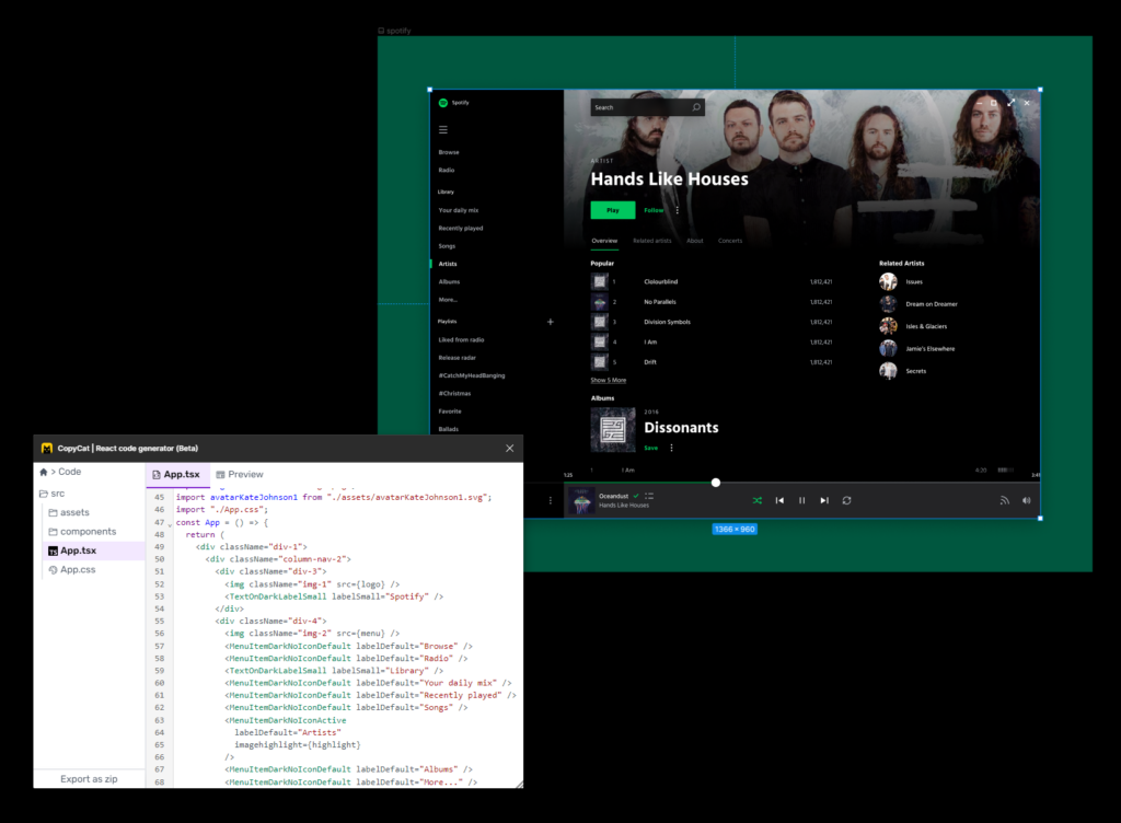
This tool can also help you convert Figma designs to MUI Components projects and react low code if you’re working on an application.
You’ll be 2X faster at developing UI. You’ll meet your deadlines and spend your time solving exciting challenges, too! Best of all, you’ll eliminate sprint delays and design inconsistencies.


