Introduction
Just like physical cards, cards in User Interface (UI) designs contain information about a particular subject. It is an organized way of presenting content in a web application.
Note that we can convert our UI designs to code from Figma using the CopyCat Figma Plugin. It is a very useful tool and saves a lot of time.
This article is a guide on how to create cards in Material UI. Let us jump in!
What is Material UI Card?
Material UI has a Card component. It can contain a header (card title), a body, a background image, and action buttons.
What is the difference between Card and Paper in Material UI?
Material UI which is a component library in React has many components. A component that works similarly to a Card is Paper. They can be mistaken for each other but below are the differences between them.
| Card | Paper |
|---|---|
| Named after physical cards | Named after physical sheets of paper |
| Extends the Paper component | Doesn’t extend any component, instead serves as a base for the Card component |
Used with its child components (e.g CardActions, CardMedia, etc) | Doesn’t have any specific child components |
| Has a set shadow or elevation | Doesn’t have a set shadow or elevation |
In other words, Paper is the base from which the Card component is built. This also shows that Papers are more dynamic than Cards. This article focuses on Cards.
Getting Started
This article assumes the reader has a basic knowledge of React JS as those are not covered here. Here is a quick guide to setting up React JS using Vite.
Install and Setup Material UI
We install Material UI by running the following command in the terminal.
1 | npm install @mui/material @emotion/react @emotion/styled |
Building a Basic Card Component
To build a basic card component, we need to import the Card component from the Material UI along with other children’s card elements we need. Here’s an example below:
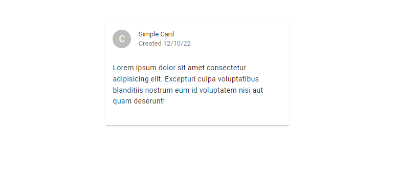
1 2 3 4 5 6 7 8 9 10 11 12 13 14 15 16 17 18 | import { Avatar, Card, CardHeader, CardContent, Typography } from '@mui/material'function CardDemo() { return ( <Card sx={{ maxWidth: '25rem', margin: '3rem auto'}}> <CardHeader avatar={<Avatar>C</Avatar>} title="Simple Card" subheader="Created 12/10/22" /> <CardContent> <Typography paragraph>Lorem ipsum dolor sit amet consectetur adipisicing elit. Excepturi culpa voluptatibus blanditiis nostrum eum id voluptatem nisi aut quam deserunt!</Typography> </CardContent> </Card> )}export default CardDemo |
The code above will display the following on the screen:

How to add a background image to Material UI Card
Material UI Cards can contain some media apart from text such as an image, a video, an iframe and so much more. All these are possible using a component called CardMedia.
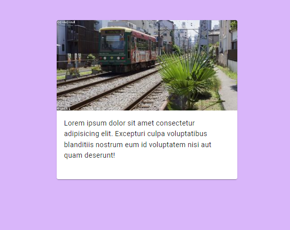
To add a background image, we use an image as our card media. The example code below illustrates it better.
1 2 3 4 5 6 7 8 9 10 11 12 13 14 15 16 17 18 19 | import { Card, CardContent, CardMedia, Typography } from '@mui/material'function CardDemo() { return ( <Card sx={{ maxWidth: '25rem', margin: '3rem auto'}}> <CardMedia component="img" height="200" alt="A Random picture found with the keyword Tokyo" /> <CardContent> <Typography paragraph>Lorem ipsum dolor sit amet consectetur adipisicing elit. Excepturi culpa voluptatibus blanditiis nostrum eum id voluptatem nisi aut quam deserunt!</Typography> </CardContent> </Card> )}export default CardDemo |
The above component will produce the below result:

Apart from these, there are many other functionalities we can add to a Material UI Card for it to display information in an elegant way.
Conclusion
In this article, we’ve learned about creating cards in Material UI and what their purpose is. We also learned the difference between Card and Paper components in Material UI.
Finally, don’t forget to check out the CopyCat Figma Plugin if you’re looking for how to increase your productivity in front development.


