- What is React Draggable?
- Installing React-Draggable
- How Does React Draggable Work?
- How do you drag a div in React?
- Draggable Event Listeners & Usage on Draggable Components
- Draggable Component Props
- Controlled vs. Uncontrolled
- What is DraggableCore?
- DraggableCore API
- How Do You Make a Draggable List in React?
- Handling the findDOMNode Deprecation Error
- Recommended Resources
- Conclusion
- Interesting Reads From Our Blogs
Have you ever wondered how popular project management software implemented draggable components that allow users to drag and drop items?
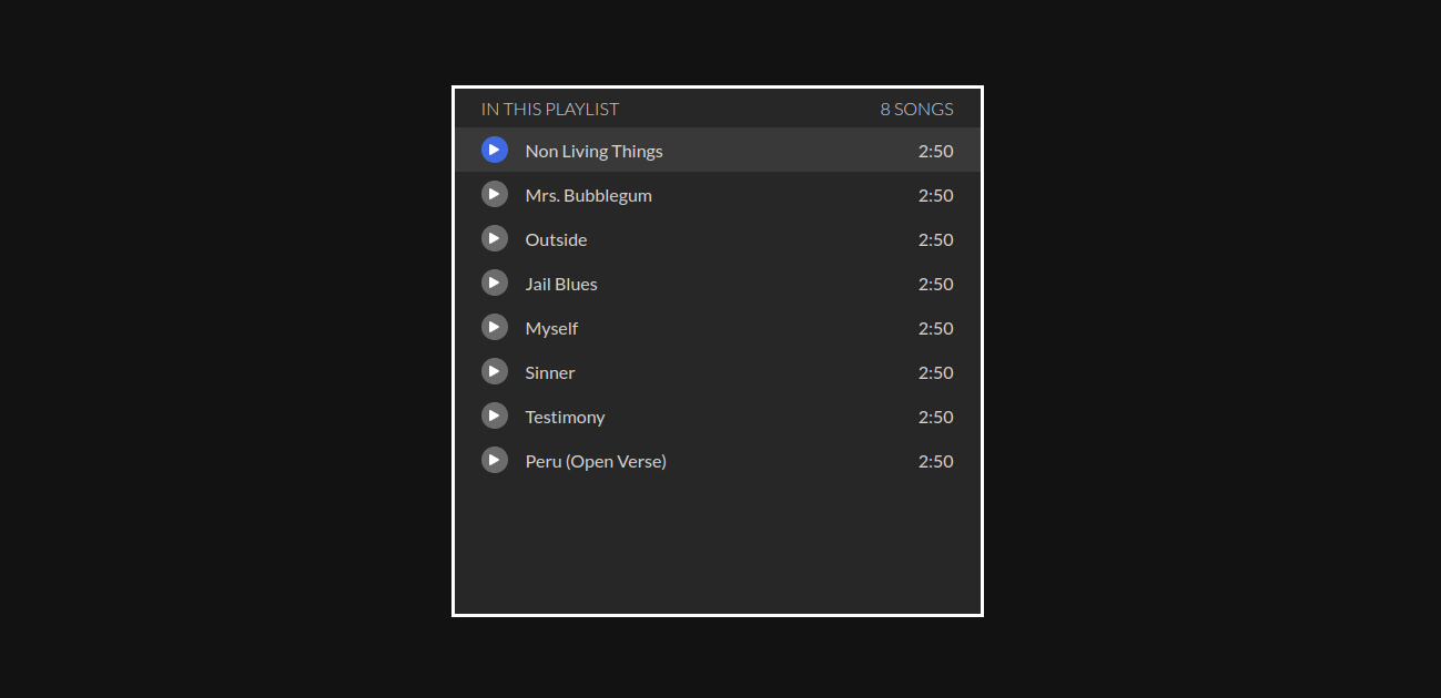
In this article, we’ll explore a library called React-Draggable in depth by creating a list with draggable components. Are you excited? Because I’m getting excited already. But before we create the list below, let’s look thoroughly at the react-draggable library.
What is React Draggable?
React-Draggable is a library that simplifies adding dragging movement to React components and elements without incidents.
Items in React-Draggable are draggable regardless of their current positioning (relative, absolute, or static). If the item you are dragging already has a CSS Transform applied, it will be overwritten by the <Draggable> component that the library makes available to us.
In any case, this library applies CSS transformations to React components, allowing users to drag components across a UI. It provides different props that give us the power to change components’ behaviour.
Installing React-Draggable
Before installing React-Draggable, make sure you have a React project set up on your local machine. Don’t worry if you don’t have any React projects on your computer, you can use the command below to create a new project.
1 | $ npx create-react-app draggable-playlist |
Navigate to the project and run the following command in the terminal:
1 | $ npm install --save react-draggable |
How Does React Draggable Work?
Now that we have our project set up and the react-draggable installed into our project, let’s see how it works in practice.
We’ll import the <Draggable/> component from the react-draggable library that we installed into our project earlier so we can add movement to an element or a component.
1 2 3 | // App.js// ES6import Draggable, {DraggableCore} from "react-draggable"; |
As seen in the code snippet above the <Draggable/> component was imported from react-draggable using the ES6 syntax. Let’s see another way of importing the <Draggable/> component using the commonJS module;
1 2 3 4 | // App.js// CommonJSconst Draggable = require('react-draggable');const DraggableCore = Draggable.DraggableCore; |
To make an element or a component draggable in our React application, we need to wrap the element or component that we want to make draggable with the <Draggable/> component around it.
Add the following code to App.js:
1 2 3 4 5 6 7 8 9 10 11 12 | // App.jsfunction App() { return ( <Draggable> <div className="App"> <h1>I can now be moved around!</h1> </div> </Draggable> );}export default App; |
How do you drag a div in React?
Now let’s see the above code snippet in action:
Draggable Event Listeners & Usage on Draggable Components
In React, events are written in camelCase syntax, for example, onClick instead of onclick. And React event handlers are written inside curly braces: onClick={shoot} instead of onClick=”shoot()”.
The React-draggable API <Draggable> has lists of event listeners for tracking any movement that initiates drag.
Call-back functions are passed into the listeners as drag handlers that also receive an event and data objects as parameters.
Additionally, the data object contains information about the current position of the draggable component.
Likewise, let’s look into what these listeners are and how they can be used;
- onDrag() — This event listener listens to the drag event and automatically calls any drag handle passed into it if any drag occurs.
1 2 3 4 5 6 7 8 9 10 11 12 13 14 15 16 17 18 19 20 | import Draggable, {DraggableCore} from 'react-draggable';import React from 'react-dom'function MyDraggableComponent() { const eventHandler = (e, data) => { console.log('Event Type', e.type); console.log({e, data}); } return ( <Draggable onDrag={eventHandler} <div style={{border: "2px solid red", padding: "1rem", width: "30%"}}> <div className="handle">Drag from here</div> <div>This readme is really dragging on the onDrag react event listener...</div> </div> </Draggable> )}export default MyDraggableComponent; |
- onStart() — This event listener reads the dragging event triggered at start-up. Consequently, If `false` is returned by any drag handler passed to this event listener, the action will cancel.
1 2 3 4 5 6 7 8 9 10 11 12 13 14 15 16 17 18 19 20 | import Draggable, {DraggableCore} from 'react-draggable';import React from 'react-dom'function MyDraggableComponent() { const eventHandler = (e, data) => { console.log('Event Type', e.type); console.log({e, data}); } return ( <Draggable onStart={eventHandler} <div style={{border: "2px solid red", padding: "1rem", width: "30%"}}> <div className="handle">Drag from here</div> <div>This readme is really dragging on the onStart react event listener...</div> </div> </Draggable> )}export default MyDraggableComponent; |
- onStop() — This event listener listens to the drag event and gets triggered when dragging stops.
1 2 3 4 5 6 7 8 9 10 11 12 13 14 15 16 17 18 19 20 | import Draggable, {DraggableCore} from 'react-draggable';import React from 'react-dom'function MyDraggableComponent() { const eventHandler = (e, data) => { console.log('Event Type', e.type); console.log({e, data}); } return ( <Draggable onStop={eventHandler}> <div style={{border: "2px solid red", padding: "1rem", width: "30%"}}> <div className="handle">Drag from here</div> <div>This readme is really dragging on the onStop react event listener...</div> </div> </Draggable> )}export default MyDraggableComponent; |
- onMouseDown() — This event gets triggered when the mouse is pressed on a draggable element. This event is fired regardless of handle or disabled status.
1 2 3 4 5 6 7 8 9 10 11 12 13 14 15 16 17 18 19 20 | import Draggable, {DraggableCore} from 'react-draggable';import React from 'react-dom'function MyDraggableComponent() { const eventHandler = (e, data) => { console.log('Event Type', e.type); console.log({e, data}); } return ( <Draggable onMouseDown={eventHandler} <div style={{border: "2px solid red", padding: "1rem", width: "30%"}}> <div className="handle">Drag from here</div> <div>This readme is really dragging on the onMouseDown react event listener...</div> </div> </Draggable> )}export default MyDraggableComponent; |
- onMouseUp() — This event gets triggered when the mouse is released on a draggable element.
1 2 3 4 5 6 7 8 9 10 11 12 13 14 15 16 17 18 19 20 21 | import Draggable, {DraggableCore} from 'react-draggable';import React from 'react-dom'function MyDraggableComponent() { const eventHandler = (e, data) => { console.log('Event Type', e.type); console.log({e, data}); } return ( <Draggable defaultPosition={{x: 0, y: 0}} onMouseUp={eventHandler} <div style={{border: "2px solid red", padding: "1rem", width: "30%"}}> <div className="handle">Drag from here</div> <div>This readme is really dragging on the onMouseUp react event listen...</div> </div> </Draggable> )}export default MyDraggableComponent; |
- onTouchStart() — This event gets triggered in the touch environment before drag start.
1 2 3 4 5 6 7 8 9 10 11 12 13 14 15 16 17 18 19 20 | import Draggable, {DraggableCore} from 'react-draggable';import React from 'react-dom'function MyDraggableComponent() { const eventHandler = (e, data) => { console.log('Event Type', e.type); console.log({e, data}); } return ( <Draggable onTouchStart={eventHandler} <div style={{border: "2px solid red", padding: "1rem", width: "30%"}}> <div className="handle">Drag from here</div> <div>This readme is really dragging on...</div> </div> </Draggable> )}export default MyDraggableComponent; |
- onTouchEnd() — This event also gets triggered in the touch environment before drag stops.
1 2 3 4 5 6 7 8 9 10 11 12 13 14 15 16 17 18 19 20 | import Draggable, {DraggableCore} from 'react-draggable';import React from 'react-dom'function MyDraggableComponent() { const eventHandler = (e, data) => { console.log('Event Type', e.type); console.log({e, data}); } return ( <Draggable onTouchEnd={eventHandler} <div style={{border: "2px solid red", padding: "1rem", width: "30%"}}> <div className="handle">Drag from here</div> <div>This readme is really dragging on...</div> </div> </Draggable> )}export default MyDraggableComponent; |
Draggable Component Props
axis
The axis prop determines which axis the draggable can move to. It receives the following string values:
- both – This string value is the default value for the axis prop. It allows movement horizontally and vertically.
- x – This string value when passed to the axis prop only allows movement to the horizontal axis.
- y – This string value limits movement to the vertical axis when passed to the axis prop.
- none – The string value “none” stops all movement both horizontally and vertically when passed to the axis prop.
1 2 3 4 5 6 | <Draggable axis="x"> <div style={{border: "2px solid red", padding: "1rem", width: "30%"}}> <div className="handle">Drag from here</div> <div>This readme is really dragging on...</div> </div></Draggable> |
handle
The handle prop defines a selector which users can use to drag any element or component. The defined selector will basically become the drag handle.
Without the handle prop, the draggable component will be used as the drag handle:
1 2 3 4 5 6 7 8 | <Draggable handle=".handle"> <div style={{border: "2px solid red", padding: "1rem", width: "30%"}}> <div style={{backgroundColor: "green", width: "30%"}} className="handle"> Drag from here </div> <div>This readme is really dragging on...</div> </div></Draggable> |
With the above snippet, we can move the component by clicking on the green background colour element.
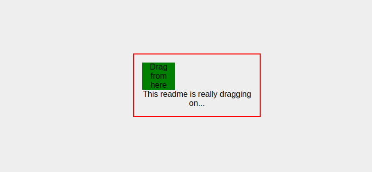
The green area is the only place users can use to drag the red box, if users try to drag the red box from somewhere else it won’t work.
defaultPosition
The defaultPosition prop specifies the x and y coordinate that the dragged item should start:
1 2 3 4 5 6 | <Draggable defaultPosition={{x: 0, y: 0}}> <div style={{border: "2px solid red", padding: "1rem", width: "30%"}}> <div className="handle">Drag from here</div> <div>This readme is really dragging on...</div> </div></Draggable> |
disabled
The disabled prop receives a Boolean value. If true, it will not call any drag handlers, this prop makes any draggable component operate like a completely static component if the boolean true is passed to it.
1 2 3 4 5 6 7 8 9 10 | <Draggable disabled={true}> <div style={{border: "2px solid red", padding: "1rem", width: "30%"}}> <div style={{backgroundColor: "green", width: "30%"}} className="handle"> Try to drag from here </div> <div> This readme is really not dragging on because it has been disabled... </div> </div></Draggable> |
bounds
The bounds prop specifies the movement boundaries. It receives any of the following values as a string:
- parent — The parent value restricts movement within the node’s offsetParent (the nearest node with position relative or absolute)
- An object with left, top, right, and bottom properties, which indicate how far in each direction the draggable can be moved
1 2 3 4 5 6 | <Draggable bounds={{left: 0, top: 0, right: 100, bottom: 200}}> <div style={{border: "2px solid red", padding: "1rem", width: "30%"}}> <div className="handle">Drag from here</div> <div>This readme is really dragging on...</div> </div></Draggable> |
With the above snippet, the movement of our component will be restricted to the specified values.
Controlled vs. Uncontrolled
Controlled components are components that handle or manage their own state or data by themselves by using state, the don’t in any way communicate directly with the Document Object Model (DOM).
The alternative is uncontrolled components, these components don’t manage their state themselves. They depend on the Document Object Model. They store data directly in the Document Object Model (DOM) itself. Instead of using an event handler for every state update, these components use a ref to get values from the Document Object Model (DOM).
The <Draggable> component from react-draggable is a ‘batteries-included’ component that manages its own state. If you would like to have complete control over the lifecycle of the component, use the <DraggableCore> component.
The <Draggable> component is a controlled component, while the <DraggableCore> component is an uncontrolled component.
What is DraggableCore?
For users that want absolute control over react-draggable, the <DraggableCore> element is available. This is useful as an abstraction over touch and mouse events, but with full control <DraggableCore> has no internal state.
See React-Resizable and React-Grid-Layout for some usage examples.
<DraggableCore> is a useful building block for other libraries that simply want to abstract browser-specific quirks and receive callbacks when a user attempts to move an element. It does not set styles or transforms on itself and thus must have callbacks attached to be useful.
DraggableCore API
<DraggableCore> takes a limited subset of options:
1 2 3 4 5 6 7 8 9 10 11 12 13 14 | { allowAnyClick: boolean, cancel: string, disabled: boolean, enableUserSelectHack: boolean, offsetParent: HTMLElement, grid: [number, number], handle: string, onStart: DraggableEventHandler, onDrag: DraggableEventHandler, onStop: DraggableEventHandler, onMouseDown: (e: MouseEvent) => void, scale: number} |
Note that there is no start position. <DraggableCore> simply calls drag handlers with the below parameters, indicating its position (as inferred from the underlying MouseEvent) and deltas. It is up to the parent to set actual positions on <DraggableCore>.
Drag callbacks (onStart, onDrag, onStop) for <DraggableCore> are called with the same arguments as <Draggable>.
How Do You Make a Draggable List in React?
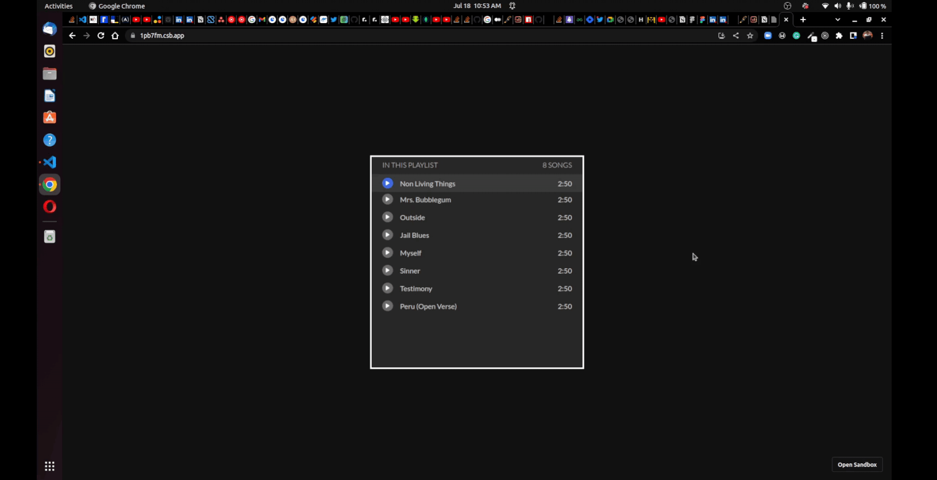
Now let’s use everything we have learned to implement our megaphone music playlist.
For the scope of this article, we will only be working on the following three things below:
- Implementing a list UI
- Displaying a list of songs on the UI
- Implementing the drag and drop feature
Let’s start by creating a new React project using create-react-app with the command below:
1 | $ npx create-react-app draggable-list |
After creating our new project, from the terminal, let’s navigate to the project directory and at the same time open the project in VSCode using the command below:
1 | $ cd draggable-list && code . |
It’s okay if VSCode is not your preferred code editor, you can use any code editor of your choice but you’d have to open the project in your preferred code editor manually because the above command works only if you have VSCode installed.
Make sure not to close the terminal because we’ll need soon to start our application. This is what the index.js file should look like.
1 2 3 4 5 6 | // index.jsimport React from 'react';import ReactDOM from 'react-dom';import App from './App';ReactDOM.render(<App />, document.getElementById('root')); |
Now, we need to restructure our project and then install all the dependencies that we’ll be needing.
Restructuring
First, we need to delete all files inside the src folder and then create our own folder structure with some empty files in them as seen below:
- components folder
- PlayList.js
- PlayListSong.js
- songs folderWe are going to add some mp3 files here from this github repository
- styles folder
- _playlist.scss
- _variables.scss
- app.scss
Next, let’s move our index.js and App.js into the src folder. After moving the files, let’s create a data.js file in the src folder. Our new folder structure should look like this now:
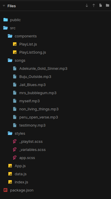
Let’s install our dependencies now. I hope we haven’t closed our terminal yet? So from the terminal, run these commands:
1 2 3 4 5 6 | $ npm i --save react-draggable$ npm i --save node-sass$ npm i --save uuid$ npm i --save @fortawesome/fontawesome-svg-core$ npm i --save @fortawesome/free-solid-svg-icons$ npm i --save @fortawesome/react-fontawesome |
After installing all our dependencies, let’s finally add code to the empty files that was created. The code for all the empty files can be found in the embedded codesandbox below:
Handling the findDOMNode Deprecation Error
When we use the draggable component in React Strict mode, “ReactDOM.findDOMNode() is deprecated” would be logged on the browser’s console as a warning.
The fix to avoid this warning in React Strict Mode is we have to pass a nodeRef as in this example:
1 2 3 4 5 6 7 8 9 10 | function MyDraggableComponent() { const nodeRef = React.useRef(null); return ( <Draggable nodeRef={nodeRef}> <div ref={nodeRef}>Example Target</div> </Draggable> );}export default MyDraggableComponent; |
Recommended Resources
Finally, we’re at the end of the article but there’s always more to learn, so if you’d like to learn more about draggable components in React and also how to build a draggable component without using a library to achieve it. I’d recommend you look up the resources below:
Conclusion
Adding movement to components in your application improves the visualization and organization of your react applications. The React-Draggable library lets you achieve this easily and it is a great choice for its simplicity and functionality.
You can also build UI faster than your competition with CopyCat. All you just need to do is copy production-ready React code generated directly from Figma designs using AI. As a result, you can focus on building interactions, animations, networking and everything else that will make you stand out and meet deadlines faster. With this tool, you can be an exceptional front-end developer who develops UI quickly.

