- Introduction
- What is Bootstrap Checkbox
- Setting Up Bootstrap
- Implementing the Bootstrap Checkbox input
- Bootstrap Form Check Input Class
- Bootstrap Form Check Label Class
- Customizing and Styling Bootstrap Checkbox
- Bootstrap Checkbox in Forms
- Checked Bootstrap Checkbox
- Standard Bootstrap Checkbox
- Inline and Stacked Bootstrap Checkboxes
- Indeterminate Bootstrap Checkbox
- Conclusion
- Interesting articles from our blog

Introduction
Checkboxes are crucial and essential html elements on websites. Without them, users would not be able to choose multiple list items or toggle options on or olff easily. As a result, customers may find it more challenging to use particular online tools or applications, as well as to access particular websites or services.
Additionally, the absence of checkboxes makes it harder for websites to get specific user information. Such as their preferences or consent for specific actions, from users.
Before we go on, check out our CopyCat tool, which will enable you to build UI quicker than your competitors. The CopyCat Figma Bootstrap plugin converts your Figma designs into fully supported, production-ready Bootstrap and React.js codes.
This article aims to guide you on how to use checkboxes with the Bootstrap framework. But in order to really comprehend and benefit from it, you must:
- Have a basic understanding of HTML/CSS
- Have a basic understanding of the Bootstrap framework
A little familiarity with Javascript is also beneficial. Additionally, we will examine what a checkbox is in the part that follows, followed by additional sections and guidelines. Enjoy!!
What is Bootstrap Checkbox

The Bootstrap checkbox is a part of the widely used HTML, CSS, and JavaScript framework for creating mobile-first, responsive web apps. Using a checkbox as an input element, a user may choose one or more alternatives from a list.
In Bootstrap, the checkbox is styled using the .form-check-input class, while the label for the checkbox is styled using the .form-check-label class. This permits the checkbox and its label to be shown inline. The checkbox will be aligned vertically with the label text.
Setting Up Bootstrap

To utilize Bootstrap in your online application, you will need to include the Bootstrap CSS and JavaScript files in the <head> section of your HTML page. You may either include these files straight from a CDN (Content Delivery Network), or you can download the Bootstrap files and host them on your own website.
Here is an example of how to incorporate the Bootstrap CSS and JavaScript files from a CDN:
1 2 3 4 | <head> <link rel="stylesheet" href="<https://stackpath.bootstrapcdn.com/bootstrap/4.5.0/css/bootstrap.min.css>" integrity="sha384-9aIt2nRpC12Uk9gS9baDl411NQApFmC26EwAOH8WgZl5MYYxFfc+NcPb1dKGj7Sk" crossorigin="anonymous"> <script src="<https://stackpath.bootstrapcdn.com/bootstrap/4.5.0/js/bootstrap.min.js>" integrity="sha384-OgVRvuATP1z7JjHLkuOU7Xw704+h835Lr+6QL9UvYjZE3Ipu6Tp75j7Bh/kR0JKI" crossorigin="anonymous"></script></head> |
In this example, the Bootstrap CSS file is included using the <link> element, while the Bootstrap JavaScript file is included using the <script> element. Both of these files are loaded via the Bootstrap CDN. As a result, this guarantees that the newest version of Bootstrap is always utilized.
Once you have included the Bootstrap CSS and JavaScript files, you can start using Bootstrap’s pre-defined classes and components in your web application.
Implementing the Bootstrap Checkbox input
You must include the Bootstrap CSS and JavaScript files in your web application in order to use a Bootstrap checkbox input, as stated in the previous response. Once you have done so, you can use the form-check-input and form-check-label classes to style the checkbox and its label.
Here’s an illustration of a Bootstrap checkbox input:
1 2 3 4 5 6 | <form> <div class="form-check"> <input type="checkbox" class="form-check-input" id="exampleCheck1"> <label class="form-check-label" for="exampleCheck1">Check me out</label> </div></form> |
In this example, the type property is set to “checkbox” and the class attribute is set to “form-check-input”. This instructs the browser to render the input as a checkbox and styles the checkbox with Bootstrap. The class property of the <label> element is set to “form-check-label”, which applies Bootstrap styles to the label text. See the result of the code implementation below;
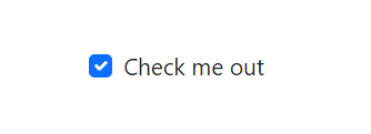
However, in the next parts of this article, we will look at further tweaks and how to simply deal with the bootstrap checkbox input.
Bootstrap Form Check Input Class
The form-check-input class is a Bootstrap utility class that may be applied to input components of the type “checkbox” or “radio.” It adds Bootstrap styling to the checkbox or radio button, to make it seem consistent with the rest of the form.
Here is an example of how to use the form-check-input class:
1 2 3 4 5 6 | <form> <div class="form-check"> <input type="checkbox" class="form-check-input" id="exampleCheck1"> <label class="form-check-label" for="exampleCheck1">Check me out</label> </div></form> |
In this example, the class attribute of the input element is set to “form-check-input”. This style applies the Bootstrap styling to the checkbox so that it matches the rest of the form.
In the same way, the form-check-input class may be used on buttons. Here’s an illustration:
1 2 3 4 5 6 7 8 9 10 11 12 13 14 | <form> <div class="form-check"> <input type="radio" class="form-check-input" id="exampleRadio1" name="exampleRadios" value="option1" checked> <label class="form-check-label" for="exampleRadio1">Option 1</label> </div> <div class="form-check"> <input type="radio" class="form-check-input" id="exampleRadio2" name="exampleRadios" value="option2"> <label class="form-check-label" for="exampleRadio2">Option 2</label> </div> <div class="form-check"> <input type="radio" class="form-check-input" id="exampleRadio3" name="exampleRadios" value="option3"> <label class="form-check-label" for="exampleRadio3">Option 3</label> </div></form> |
In this example, three radio buttons with their own labels are constructed. To add the Bootstrap styling to the buttons, the form-check-input class is added to the input html elements.
Using the different Bootstrap classes, you may change the look of the checkbox or radio button inputs. To show the inputs and their labels inline, use the form-check-inline class on the div element that wraps the checkbox or radio button inputs. Here’s an illustration:
1 2 3 4 5 6 7 8 9 10 | <form> <div class="form-check form-check-inline"> <input type="checkbox" class="form-check-input" id="exampleCheck1"> <label class="form-check-label" for="exampleCheck1">Option 1</label> </div> <div class="form-check form-check-inline"> <input type="checkbox" class="form-check-input" id="exampleCheck2"> <label class="form-check-label" for="exampleCheck2">Option 2</label> </div></> |
Bootstrap Form Check Label Class
You would have noticed that in the section above there were instances where the <label></label> ****tag and the label class were used.
However, the Bootstrap class form-check-label is used to customize the label for a checkbox input. This class is applied to the checkbox’s label element, and it adds the Bootstrap styles to the label text.
The form-check-label class may be used in conjunction with the form-check-input class, which is applied to the checkbox’s input element. This displays the checkbox and its label inline, with the checkbox aligned vertically with the label text.
Here’s an example of using the form-check-label class:
1 2 3 4 5 6 | <form> <div class="form-check"> <input type="checkbox" class="form-check-input" id="exampleCheck1"> <label class="form-check-label" for="exampleCheck1">Check me out</label> </div></form> |
In this example, the type property is set to “checkbox” and the class attribute is set to “form-check-input”. This instructs the browser to render the input as a checkbox and styles the checkbox with Bootstrap. Additionally, the class property of the label element is set to “form-check-label”, which applies Bootstrap style to the label text.
The look of the checkbox label may be customized using the different Bootstrap classes. To show the checkbox and its label inline, use the form-check-inline class on the div element that wraps the checkbox.
Customizing and Styling Bootstrap Checkbox
Already some of the sections above had already started talking briefly about the customization and styling of the Boostrap checkbox input. But there is more to it than that and, in this section, we would dig deep into learning how to make your Bootstrap checkbox inputs customized and styled using the Bootstrap framework.
However, as discussed earlier, using the different Bootstrap classes, you may alter and configure the appearance of a Bootstrap checkbox input. These classes let you customize the checkbox’s color, size, and layout, as well as its label text.
To show the checkbox and its label inline, use the form-check-inline class on the div element that wraps the checkbox. Here’s an illustration:
1 2 3 4 5 6 | <form> <div class="form-check form-check-inline"> <input type="checkbox" class="form-check-input" id="exampleCheck1"> <label class="form-check-label" for="exampleCheck1">Check me out</label> </div></form> |
The form-check-inline class is added to the div element that wraps the checkbox in this example, causing the checkbox and its label to be shown inline.
You can also use the form-check-inline class on the label element to display the label inline rather than on a separate line. Here’s an illustration:
1 2 3 4 5 6 | <form> <div class="form-check"> <input type="checkbox" class="form-check-input" id="exampleCheck1"> <label class="form-check-label form-check-inline" for="exampleCheck1">Check me out</label> </div></form> |
The form-check-inline class is added to the label element in this example, causing the label text to be displayed inline with the checkbox.
Adjusting Checkbox Size
You can also adjust the size of the checkbox by using the form-check-input class on the input element.
For the checkbox input, Bootstrap supports the following sizes:
- form-check-input-sm – for small checkboxes
- form-check-input-lg – for large checkboxes
Here is an example of how to use these classes:
1 2 3 4 5 6 7 8 9 10 | <form> <div class="form-check form-check-inline"> <input type="checkbox" class="form-check-input form-check-input-sm" id="exampleCheck1"> <label class="form-check-label form-check-inline" for="exampleCheck1">Small checkbox</label> </div> <div class="form-check form-check-inline"> <input type="checkbox" class="form-check-input form-check-input-lg" id="exampleCheck2"> <label class="form-check-label form-check-inline" for="exampleCheck2">Large checkbox</label> </div> </form> |
In the above implementation the form-check-inline class is used to display the checkboxes inline, this means that they would appear side by side. Also, the form-check-input-sm and form-check-input-lg classes are used to make the checkboxes small and large or big respectively.
See the sample result below:

You can also modify the color of the label text by using the form-check-label class on the label element. Here’s an illustration:
1 2 3 4 5 6 7 8 9 10 | <form> <div class="form-check form-check-inline"> <input type="checkbox" class="form-check-input form-check-input-sm" id="exampleCheck1"> <label class="form-check-label form-check-inline text-primary" for="exampleCheck1">Primary color</label> </div> <div class="form-check form-check-inline"> <input type="checkbox" class="form-check-input form-check-input-lg" id="exampleCheck2"> <label class="form-check-label form-check-inline text-secondary" for="exampleCheck2">Secondary color</label> </div></form> |
The text-primary class is applied to the label of the first checkbox in this example, changing the color of the label text to the primary color. When the text-secondary class is applied to the label of the second checkbox, the color of the label text changes to the secondary color. See the sample result below:

Bootstrap Checkbox in Forms
A Bootstrap checkbox input, along with other form controls like text inputs, chooses boxes, and radio buttons may be used in a form. To utilize a checkbox in a form, enclose it in a div element with the form-check class. This class styles the checkbox input and its label using Bootstrap.
Here’s an example of using a checkbox in a form:
1 2 3 4 5 6 7 8 9 10 11 12 13 14 15 | <form> <div class="form-group"> <label for="exampleInputEmail1">Email address</label> <input type="email" class="form-control" id="exampleInputEmail1" aria-describedby="emailHelp"> </div> <div class="form-group"> <label for="exampleInputPassword1">Password</label> <input type="password" class="form-control" id="exampleInputPassword1"> </div> <div class="form-group form-check"> <input type="checkbox" class="form-check-input" id="exampleCheck1"> <label class="form-check-label" for="exampleCheck1">Check me out</label> </div> <button type="submit" class="btn btn-primary">Submit</button></form> |
The checkbox is enclosed inside a div element with the form-check class in this example. The type property of the input element is set to “checkbox” and the class attribute is set to “form-check-input” This instructs the browser to render the input as a checkbox and styles the checkbox with Bootstrap. The class property of the label element is set to “form-check-label” which applies Bootstrap style to the label text.
The checkbox input will be included in the data sent to the server when the form is submitted. The value of the checkbox input can then be accessed on the server side to determine whether it was checked or not.
Checked Bootstrap Checkbox
When a Bootstrap checkbox is checked, the user has chosen the checkbox input. In other words, the checkbox is “checked” and the value is “on.”
The value of the checked property on the input element determines the checked state of a checkbox. The checkbox is assumed to be checked by default if the checked property is present. When the checked attribute is missing, the checkbox is assumed to be unchecked by default.
Moving on, the checked property on the input element may be used to make a Bootstrap checkbox input checked by default. Here’s an illustration:
1 2 3 4 5 6 | <form> <div class="form-check"> <input type="checkbox" class="form-check-input" id="exampleCheck1" checked> <label class="form-check-label" for="exampleCheck1">Check me out</label> </div></form> |
The checked property on the input element in this example instructs the browser to render the checkbox as checked by default.
When the form is submitted, the checkbox input with the value “checked” ****is included in the data sent to the server. On the server side, you can then retrieve the value of the checkbox input to see if it was ticked or not.
Standard Bootstrap Checkbox
A basic Bootstrap checkbox is a straightforward checkbox input that may be used in conjunction with other form controls like text inputs, choose boxes, and radio buttons. To utilize a checkbox in a form, enclose it in a <div> element with the form-check class. This class styles the checkbox input and its label using Bootstrap.
An example of a typical Bootstrap checkbox is shown below:
1 2 3 4 5 6 | <form> <div class="form-check"> <input type="checkbox" class="form-check-input" id="exampleCheck1"> <label class="form-check-label" for="exampleCheck1">Check me out</label> </div></form> |
The checkbox is enclosed inside a div element with the form-check class in this example. The type property of the input element is set to “checkbox” and the class attribute is set to form-check-input. This instructs the browser to render the input as a checkbox and styles the checkbox with Bootstrap. The class property of the label element is set to “form-check-label” which applies Bootstrap style to the label text.
The checkbox is represented on the website by a little square box that the user may click or press. A check mark will show within the box when the user clicks or touches it, indicating that the checkbox is ticked.
Inline and Stacked Bootstrap Checkboxes
Checkbox inputs in Bootstrap are available in two styles: inline and stacked.
Inline checkboxes are shown on the same line as their label text, whereas stacked checkboxes are displayed on a separate line.
To generate inline checkboxes, apply the form-check-inline class to the div or label element that contains the checkbox. Here’s an example of a checkbox inline:
1 2 3 4 5 6 7 8 9 10 11 12 13 14 | <form> <div class="form-check form-check-inline"> <input type="checkbox" class="form-check-input" id="exampleCheck1"> <label class="form-check-label" for="exampleCheck1">Option 1</label> </div> <div class="form-check form-check-inline"> <input type="checkbox" class="form-check-input" id="exampleCheck2"> <label class="form-check-label" for="exampleCheck2">Option 2</label> </div> <div class="form-check form-check-inline"> <input type="checkbox" class="form-check-input" id="exampleCheck3"> <label class="form-check-label" for="exampleCheck3">Option 3</label> </div></form> |
See the result below;

The form-check-inline class is added to the div element that wraps the checkbox in this example, causing the checkbox and its label to be shown inline.
Alternatively, the checkboxes in a stacked arrangement are presented vertically, one on top of the other. Simply remove the form-check-inline class from the div or label element that wraps the checkbox to create a stacked layout.
Here’s an illustration:
1 2 3 4 5 6 7 8 9 10 | <form> <div class="form-check"> <input type="checkbox" class="form-check-input" id="exampleCheck1"> <label class="form-check-label" for="exampleCheck1">Option 1</label> </div> <div class="form-check"> <input type="checkbox" class="form-check-input" id="exampleCheck2"> <label class="form-check-label" for="exampleCheck2">Option 2</label> </div></form> |
See the result for the above code illustration below:
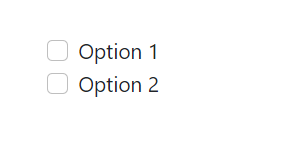
Because the form-check-inline class is not used in this example, the checkboxes are displayed vertically, one on top of the other.
Depending on the design of your form and the amount of space available, you can use either the inline or stacked layout for the checkboxes.
Indeterminate Bootstrap Checkbox

A Bootstrap checkbox may be made to be ambiguous, meaning it is neither checked nor unchecked. This condition is frequently used when a set of checkboxes is connected to one another and some are ticked while others are not.
The indeterminate property on the input element may be used to generate an indeterminate checkbox.
As an illustration:
1 2 3 4 5 6 | <form> <div class="form-check"> <input type="checkbox" class="form-check-input" id="exampleCheck1" indeterminate> <label class="form-check-label" for="exampleCheck1">Check me out</label> </div></form> |
The indeterminate property on the input element in this example instructs the browser to present the checkbox in an uncertain state. When the checkbox appears on the website, a horizontal line will appear inside the square box, indicating that it is in an ambiguous condition.
You may also change the checkbox to an indeterminate state with JavaScript. As an example, consider the following:
1 2 3 4 5 6 7 8 9 10 11 12 13 14 | <form> <div class="form-check"> <input type="checkbox" class="form-check-input" id="exampleCheck1"> <label class="form-check-label" for="exampleCheck1">Check me out</label> </div></form><script> // Get the checkbox input var checkbox = document.getElementById("exampleCheck1"); // Set the checkbox to be indeterminate checkbox.indeterminate = true;</script> |
In this example, the JavaScript code uses the getElementById() function to obtain a reference to the checkbox input and sets the indeterminate attribute to true. As a result, the checkbox is shown in an uncertain state.
Conclusion
In conclusion, the Bootstrap checkbox is an effective tool for web designers to construct intuitive and attractive websites. With the guide from this article, developers may simply include this potent feature in their web applications. The Bootstrap checkbox may significantly improve the user experience and functionality of a website by allowing users to change settings and pick numerous alternatives.
However, if you have any questions or doubts, or contributions, please drop them in the comment section below. Also if you prefer to go further in understanding how to use checkboxes in bootstrap you may check out the video resource below:
Check out the CopyCat plugin for React if you’re searching for a fantastic React tool to make it easier for you to build component code more quickly and be production ready. Also check out the Copycat blog here for more intriguing articles.

