- Introduction
- Prerequisites
- Bootstrap All Colors and Full Palette
- Bootstrap Theme Colors
- What are the Bootstrap Shade Variants?
- How to use Bootstrap Color in Backgrounds?
- Background Gradients in Bootstrap Background Colors
- How to use Bootstrap Colors in Texts?
- How to Colorize Links With Bootstrap Colors?
- How to Customize Buttons using Bootstrap Colors?
- Customizing Outline buttons using Bootstrap Color utility
- Bootstrap Button Size
- Conclusion
- Interesting Reads from our Blog

Introduction
Color plays a vital role in aiding visitors’ navigation through the site, guiding them through the site content quickly and easily, along with a well-designed user interface. In addition to assisting in developing a content hierarchy, color can draw attention to essential details and calls to action.
However, Bootstrap comes with a robust color scheme that allows us to theme our styles and components. This allows for greater customization and extension of any project. In this article, we will be discussing everything about understanding Bootstrap colors and the application or usage of Bootstrap color utilities.
Before we continue, check out our CopyCat tool, which will help you design UI quicker than your rivals. Accordingly, your Figma designs are transformed into fully supported, production-ready Bootstrap and React.js codes with the CopyCat Figma Bootstrap plugin.
Prerequisites
- Basic knowledge of HTML/CSS
- Basic knowledge of Bootstrap CSS
Bootstrap All Colors and Full Palette
Over the years the Bootstrap team has been working greatly in making frontend web development easier for developers. In this case, the Bootstrap team has made available 14 primary Bootstrap colors. Bootstrap has also made use of only a subset of these colors to create a smaller color palette that brings about Bootstrap theme colors.
All Bootstrap colors are available in the SCSS/ variables. SCSS file as SASS variables and a SASS map. For each of these variables, Bootstrap does not create text or background color classes in order to reduce file sizes. Instead, they decide on a smaller subset of these hues to create a themed palette.
The available bootstrap in all colors are;
1 2 3 4 5 6 7 8 9 10 11 12 13 14 15 16 | $colors: ( "blue": $blue, "indigo": $indigo, "purple": $purple, "pink": $pink, "red": $red, "orange": $orange, "yellow": $yellow, "green": $green, "teal": $teal, "cyan": $cyan, "black": $black, "white": $white, "gray": $gray-600, "gray-dark": $gray-800); |
Bootstrap Theme Colors

As discussed earlier in this article, In the Bootstrap SCSS/ variables. SCSS file, a smaller color palette created by Bootstrap using a subset of all Bootstrap’s colors is also available as SASS variables and a SASS map. Therefore, this allows for greater customization and extension of any project.
The Bootstrap’s theme colors can be seen in the following lines of code below;
1 2 3 4 5 6 7 8 9 10 | $theme-colors: ( "primary": $primary, "secondary": $secondary, "success": $success, "info": $info, "warning": $warning, "danger": $danger, "light": $light, "dark": $dark); |
With these theme colors, Bootstrap provides classes that have the ability to add color, depending on the element being used. With these themes, code reading becomes easier as clues are provided through the class names.
However, these classes can be used for both Bootstrap text color and background color, as well as coloring elements, by using different prefixes. In other words, this means that;
*-dark alters the element’s color to dark gray #343a49 dark gray #343a40.
*-primary alters the element’s color to blue #007bff blue #007bff.
*-info changes the color to teal #17a2b8 teal #17a2b8.
*-success alters the element’s color to green #28q745 green #28a745.
*-warning alters the element’s color to yellow #ffc107 yellow #ffc107.
*-danger alters the element’s color to red #dc3545 red #dc3545.
*-secondary alters the element’s color to gray #6c757d gray #6c757d.
*-light alters the element’s color to light gray #f8f9fa gray #f8f9fa.
*-white alters the element’s color to white #ffffff white #ffffff.
The * can be replaced by various class prefixes depending on what you need the color for (such as text). For example;
1 | <p class="text-success">For the green text: .text-success</p> |
As shown above, the code gives a result of a green text, see below;

What are the Bootstrap Shade Variants?
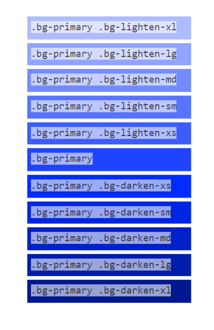
Shade variants in Bootstrap are utilities that control how light or deep/dark a color is. Because background colors use hsla() , in Bootstrap, it is easier to make background colors lighter or darker at different levels. Let us take for instance we want to archive the shade variant in the image below;

This can be achieved by making use of the `.bg-<variant>-<value> ` Bootstrap’s utility class. where variant is ;
- lighten – utility class to lighten background colors.
- darken – utility class to darken background colors.
Also, the values are and can be ;
- xs
- sm
- md
- lg
- xl
This controls the levels or degrees of how light or dark a background color should appear. The technical and code application can be seen and experimented within the lines of code below;
1 2 3 4 5 6 7 8 9 10 11 | <div class=".bg-primary .bg-lighten-xl">.bg-primary .bg-lighten-xl</div><div class=".bg-primary .bg-lighten-lg">.bg-primary .bg-lighten-lg</div><div class=".bg-primary .bg-lighten-md">.bg-primary .bg-lighten-md</div><div class=".bg-primary .bg-lighten-sm">.bg-primary .bg-lighten-sm</div><div class=".bg-primary .bg-lighten-xs">.bg-primary .bg-lighten-xs</div><div class=".bg-primary">.bg-primary</div><div class=".bg-primary .bg-darken-xl">.bg-primary .bg-darken-xl</div><div class=".bg-primary .bg-darken-lg">.bg-primary .bg-darken-lg</div><div class=".bg-primary .bg-darken-md">.bg-primary .bg-darken-md</div><div class=".bg-primary .bg-darken-sm">.bg-primary .bg-darken-sm</div><div class=".bg-primary .bg-darken-xs">.bg-primary .bg-darken-xs</div> |
This would result as;
How to use Bootstrap Color in Backgrounds?

Background colors in websites are crucial because they make the site more visually appealing, draw users’ attention to a particular section, and make the colored text easier to read.
Thanks to Bootstrap, they have made it easier and smooth in adding background colors to sections in websites by adding the .bg- utility class. To illustrate, the combination of Bootstrap theme colors with the .bg- class creates and results in background colors in bootstrap. Let us take a look at the following lines of code below which demonstrate how to use Bootstrap theme colors as background colors in websites.
1 2 3 4 5 6 7 8 9 10 11 12 13 14 15 | <div class="container"> <h1>Bootstrap Background Colors</h1> <div class="bg-primary ">.bg-primary</div> <div class="bg-secondary ">.bg-secondary</div> <div class="bg-success ">.bg-success</div> <div class="bg-info ">.bg-info</div> <div class="bg-warning ">.bg-warning</div> <div class="bg-danger ">.bg-danger</div> <div class="bg-light ">.bg-light</div> <div class="bg-dark ">.bg-dark</div> <div class="bg-gray ">.bg-gray</div> <div class="bg-body ">.bg-body</div> <div class="bg-white ">.bg-white</div> <div class="bg-transparent ">.bg-transparent</div> </div> |
The lines of code show us how we can make use of Bootstrap colors as background colors using the .bg-* class utility. The result of the code implementation above can be seen in the image below;
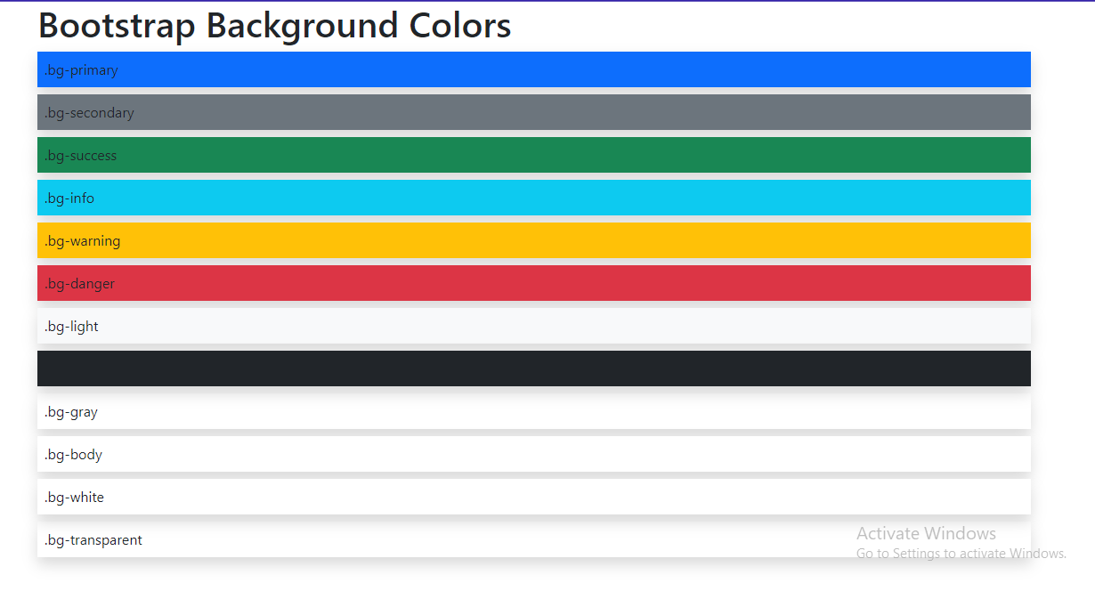
As shown above in the image, the `.bg-primary` class adds a blue background to the div, the same as the .bg-danger class adds a red background to the div. This way background colors can be added to HTML elements, elements like divs, buttons, cards, spans, etc. To illustrate, below we would go through how to use Bootstrap colors as background colors in cards.
1 2 3 4 5 6 7 8 9 10 11 12 13 14 15 16 17 18 19 20 21 22 23 24 25 26 27 28 29 30 31 32 33 34 35 36 37 38 39 40 41 42 43 44 45 46 47 48 49 50 51 52 53 54 | <div class="p-2 my-2"> <h1>Bootstrap Background Colors in Cards</h1> <div class=" d-flex justify-content-around flwx-nowrap"> <div class="card bg-primary p-2 m-2 shadow "> <div class="card-body"> <h5 class="card-title">.bg-primary</h5> <p class="card-text">Some quick example text to build on the card title and make up the bulk of the card's content.</p> </div> </div> <div class="card bg-secondary p-2 m-2 shadow "> <div class="card-body"> <h5 class="card-title">.bg-secondary</h5> <p class="card-text">Some quick example text to build on the card title and make up the bulk of the card's content.</p> </div> </div> <div class="card bg-success p-2 m-2 shadow "> <div class="card-body"> <h5 class="card-title">.bg-success</h5> <p class="card-text">Some quick example text to build on the card title and make up the bulk of the card's content.</p> </div> </div> <div class="card bg-info p-2 m-2 shadow "> <div class="card-body"> <h5 class="card-title">.bg-info</h5> <p class="card-text">Some quick example text to build on the card title and make up the bulk of the card's content.</p> </div> </div> <div class="card bg-warning p-2 m-2 shadow "> <div class="card-body"> <h5 class="card-title">.bg-warning</h5> <p class="card-text">Some quick example text to build on the card title and make up the bulk of the card's content.</p> </div> </div> <div class="card bg-danger p-2 m-2 shadow "> <div class="card-body"> <h5 class="card-title">.bg-danger</h5> <p class="card-text">Some quick example text to build on the card title and make up the bulk of the card's content.</p> </div> </div> </div> </div> |
In the above code implementation, we can notice the background color classes are added to the divs with the card class, for example;
1 | class="card bg-danger" |
With these classes added to the div with the card class, it gives a beautiful background color to the cards. See the result below;

Background Gradients in Bootstrap Background Colors
Every front-end web developer is concerned with making and building good-looking websites that are soothing to the eyes. Gradients in background colors add a soothing tone and smoothness to background colors.
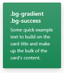
The Bootstrap background gradient can be activated by adding the .bg-gradient class. This adds a linear gradient as a background image to the backgrounds. This gradient begins with a semi-transparent white and fades to the bottom.
We would take a look at how our earlier implementation of Bootstrap colors as background in cards would turn out on adding the gradient utility class to the cards in the code implementation below;
1 2 3 4 5 6 7 8 9 10 11 12 13 14 15 16 17 18 19 20 21 22 23 24 25 26 27 28 29 30 31 32 33 34 35 36 37 38 39 40 41 42 43 44 45 46 47 48 49 50 51 52 53 54 | <div class="p-2 my-2"> <h1>Bootstrap Background Colors in Cards</h1> <div class=" d-flex justify-content-around flwx-nowrap"> <div class="card bg-gradient bg-primary p-2 m-2 shadow "> <div class="card-body"> <h5 class="card-title">.bg-gradient .bg-primary</h5> <p class="card-text">Some quick example text to build on the card title and make up the bulk of the card's content.</p> </div> </div> <div class="card bg-gradient bg-secondary p-2 m-2 shadow "> <div class="card-body"> <h5 class="card-title">.bg-gradient .bg-secondary</h5> <p class="card-text">Some quick example text to build on the card title and make up the bulk of the card's content.</p> </div> </div> <div class="card bg-gradient bg-success p-2 m-2 shadow "> <div class="card-body"> <h5 class="card-title">.bg-gradient .bg-success</h5> <p class="card-text">Some quick example text to build on the card title and make up the bulk of the card's content.</p> </div> </div> <div class="card bg-gradient bg-info p-2 m-2 shadow "> <div class="card-body"> <h5 class="card-title">.bg-gradient .bg-info</h5> <p class="card-text">Some quick example text to build on the card title and make up the bulk of the card's content.</p> </div> </div> <div class="card bg-gradient bg-warning p-2 m-2 shadow "> <div class="card-body"> <h5 class="card-title">.bg-gradient .bg-warning</h5> <p class="card-text">Some quick example text to build on the card title and make up the bulk of the card's content.</p> </div> </div> <div class="card bg-gradient bg-danger p-2 m-2 shadow "> <div class="card-body"> <h5 class="card-title">.bg-gradient .bg-danger</h5> <p class="card-text">Some quick example text to build on the card title and make up the bulk of the card's content.</p> </div> </div> </div></div> |
The result of the code implementation above can be seen in the image below;

As shown above in the image, we now have our cards’ background colors in gradients. The differences can be compared by adding and removing the bg-gradient class.
How to use Bootstrap Colors in Texts?
In this article, we have discussed over and over the importance of colors on websites. Colors in the text are important as they help in projecting and bringing out the words clearly to use when used on background colors.
For instance, in our previous implementation of background colors in cards, we have some cards with poor text colors as they cannot be read easily on sight. See the image below;
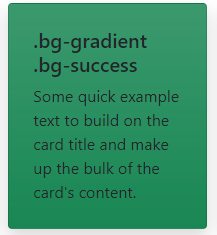
Let us compare this to when a comfortable text color is added to the text on the card in the image below;
We can now see how easy and soothing it is to read the text in the card above.
The Bootstrap team has made it easier for developers when adding colors to the text by providing the .text-* class utility which easily adds color to texts and also includes support for styling links with hover states (when the mouse hovers on elements).
We would look at how to make use of the .text-* utility class with different Bootstrap theme colors in the lines of code below;
1 2 3 4 5 6 7 8 9 10 11 12 | <div class="container"> <h1>Bootstrap Text Colors</h1> <div class="text-primary p-2 my-2 shadow ">.text-primary</div> <div class="text-secondary p-2 my-2 shadow ">.text-secondary</div> <div class="text-success p-2 my-2 shadow ">.text-success</div> <div class="text-info p-2 my-2 shadow ">.text-info</div> <div class="text-warning p-2 my-2 shadow ">.text-warning</div> <div class="text-danger p-2 my-2 shadow ">.text-danger</div> <div class="text-light p-2 my-2 shadow ">.text-light</div> <div class="text-dark p-2 my-2 shadow ">.text-dark</div> <div class="text-white p-2 my-2 shadow ">.text-white</div> </div> |
In the code implementation above we can see that the .text-* class are been applied to the div to affect the colors for the text. We can take a look at the result for the above code implementation below;

With the .text-* color can be added easily to texts and text elements in Bootstrap, in H1, H2, H3, P tags, etc
How to Colorize Links With Bootstrap Colors?
The browser has a default way of rendering links, which majorly is a blue text with a blue underline. See the illustration below;

It is obvious this format would not be suitable in all use cases and across all designs. The links might not need to appear with an underline, the links might need to appear in other colors to suit or blend with the already existing color system around it.
However Bootstrap has made available the .link-* utility class to colorize links. It is important to note that the .text-* and .link-* have a difference. The link classes have two states: hover and focus, in contrast to the. text-* classes.
This means that with the text classes nothing happens when the mouse moves on the styled elements, but with link classes, it either adds a deeper tone or a lighter tone to the color on the links.
We would look at how to apply and make use of the .link-* class the lines of code below;
1 2 3 4 5 6 7 8 | <a href="#" class="link-primary">Primary link</a><a href="#" class="link-secondary">Secondary link</a><a href="#" class="link-success">Success link</a><a href="#" class="link-danger">Danger link</a><a href="#" class="link-warning">Warning link</a><a href="#" class="link-info">Info link</a><a href="#" class="link-light">Light link</a><a href="#" class="link-dark">Dark link</a> |
The result of the code implementation can be found in the image below;

How to Customize Buttons using Bootstrap Colors?
The Bootstrap team has paid so much attention and work into making customizable and easily stylable buttons easy for developers. These styles can be used in forms, dialogs, nav-menus, etc with support for sizes, active state, disabled state, and more.
However Bootstrap uses the .btn class to style buttons. The button element is intended to be used with the .btn classes. The <a> and <input> elements can, however, also use these classes (though some browsers may apply a slightly different rendering).
It is important to note that, while linking to new pages or sections within the current page when using button classes on <a> elements that are used to activate in-page functionality (like collapsing content), these links should be given a role=”button”, conveying meaning to assistive technologies like screen readers. See the example below;
1 | <a class="btn btn-primary" href="#" role="button">Link</a> |
Examples of using Bootstrap Colors in Buttons
Each predefined button style in Bootstrap serves a distinct semantic function, with a few extras thrown in for extra control.
We would be looking at the code implementation for using bootstrap color utilities in the buttons below;
1 2 3 4 5 6 7 8 9 | <button type="button" class="btn btn-primary">Primary</button><button type="button" class="btn btn-secondary">Secondary</button><button type="button" class="btn btn-success">Success</button><button type="button" class="btn btn-danger">Danger</button><button type="button" class="btn btn-warning">Warning</button><button type="button" class="btn btn-info">Info</button><button type="button" class="btn btn-light">Light</button><button type="button" class="btn btn-dark">Dark</button><button type="button" class="btn btn-link">Link</button> |
Let us take a look at the results of the above code implementation in the image below;

As seen in the image above the .btn-* class bootstrap colors were added to the buttons.
Moreover, in some cases, button styles differ as they might need to be styled to appear with a background image/color or with an outline. In the section below we would be looking at outline buttons in bootstrap.
Customizing Outline buttons using Bootstrap Color utility
As discussed earlier in the section above, there could be a need for buttons without heavy background colors. Bootstrap has made an available handful of color utility classes that brings about making outline buttons by replacing the default modifier classes (`btn btn-primary`) with .btn-outline-* to remove background colors on any button and give a border outline around the buttons.
The code implementation can be seen below;
1 2 3 4 5 6 7 8 | <button type="button" class="btn btn-outline-primary">Primary</button><button type="button" class="btn btn-outline-secondary">Secondary</button><button type="button" class="btn btn-outline-success">Success</button><button type="button" class="btn btn-outline-danger">Danger</button><button type="button" class="btn btn-outline-warning">Warning</button><button type="button" class="btn btn-outline-info">Info</button><button type="button" class="btn btn-outline-light">Light</button><button type="button" class="btn btn-outline-dark">Dark</button> |
The result for the above code implementation can be seen below;

Also, it is important to note that aside from color utilities button size and states can be controlled using bootstrap utility classes. In the section below we would look at bootstrap button sizes and how to implement them into the implemented buttons above.
Bootstrap Button Size
Sizes in button styles matter in websites as some buttons need to be large and big to draw the user’s attention. However with the use of utilities like lg, sm along with the .btn-* class. Customizing button sizes are done easily. Let us take a look at how to make use of these classes to resize our buttons above in the code implementation below;
1 2 3 4 5 6 7 8 9 10 11 12 | <div class="container shadow p-2 mt-10"> <h1>Bootstrap Buttons</h1> <button type="button" class="btn btn-primary btn-lg mx-2 shadow">Primary</button> <button type="button" class="btn btn-secondary btn-sm mx-2 shadow">Secondary</button> <button type="button" class="btn btn-success btn-lg mx-2 shadow">Success</button> <button type="button" class="btn btn-danger btn-sm mx-2 shadow">Danger</button> <button type="button" class="btn btn-warning btn-lg mx-2 shadow">Warning</button> <button type="button" class="btn btn-info btn-sm mx-2 shadow">Info</button> <button type="button" class="btn btn-light btn-lg mx-2 shadow">Light</button> <button type="button" class="btn btn-dark btn-sm mx-2 shadow">Dark</button> <button type="button" class="btn btn-link btn-lg mx-2 shadow">Link</button> </div> |
The result of the code implementation above can be examined below;

Conclusion
Without doubts, we have been able to see the importance of colors in websites and also the different ways Bootstrap colors can be used in different elements in Bootstrap such as using Bootstrap colors in texts, using Bootstrap colors in buttons, using Bootstrap colors as background image/colors. We have also talked about the Bootstrap all colors and theme colors, Bootstrap shade variants, different examples, and code snippets. With this knowledge working with colors in Bootstrap would be a piece of cake.
Check out the CopyCat plugin for React if you’re searching for a fantastic React tool to make it easier for you to build React component more quickly and be production ready. Check out the Copycat blog here for more intriguing reads.

