Introduction
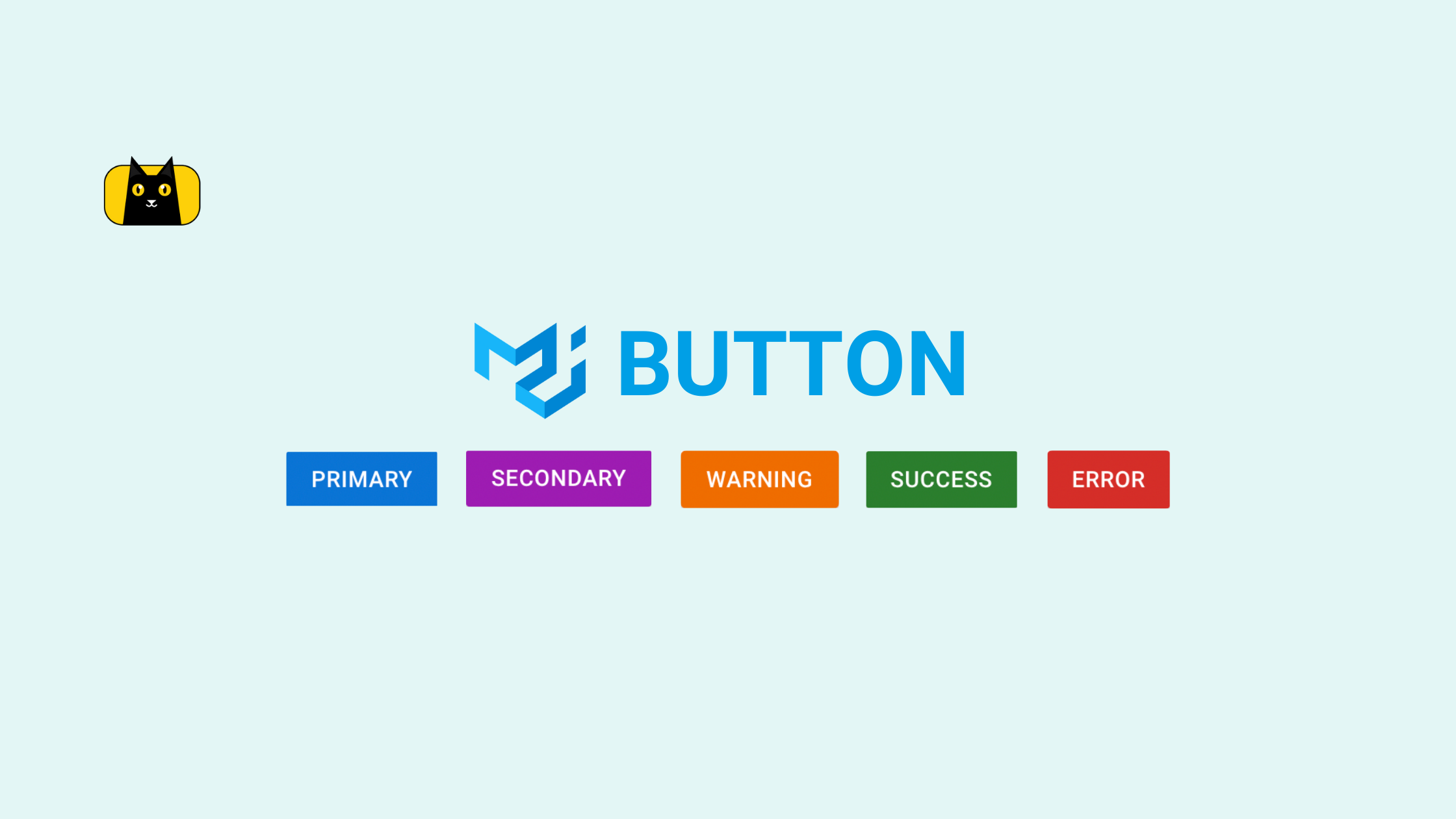
Are you looking to add buttons to your React app? Material UI buttons provide an easy library for creating and customizing buttons with minimal coding.
In this article, you’ll learn how to install and use the material UI button component in your React projects. You’ll also learn how to create Icon buttons and reusable button components.
Before getting started, here is a brief introduction to the material UI library and why it’s popular.
What is Material UI Button?
Material UI button is part of the MUI package. MUI is a library used for styling React applications. It has many ready-made styles and templates you can easily integrate into your project.
This library promotes low code development and helps developers build UI faster. Material UI button is one of the components you can use to generate beautiful buttons for your project without writing any CSS to style the component.
Speaking of low code development, CopyCat provides an easy way to build React components faster. With your Figma designs, you can use our tool to generate production-level code for your web pages.
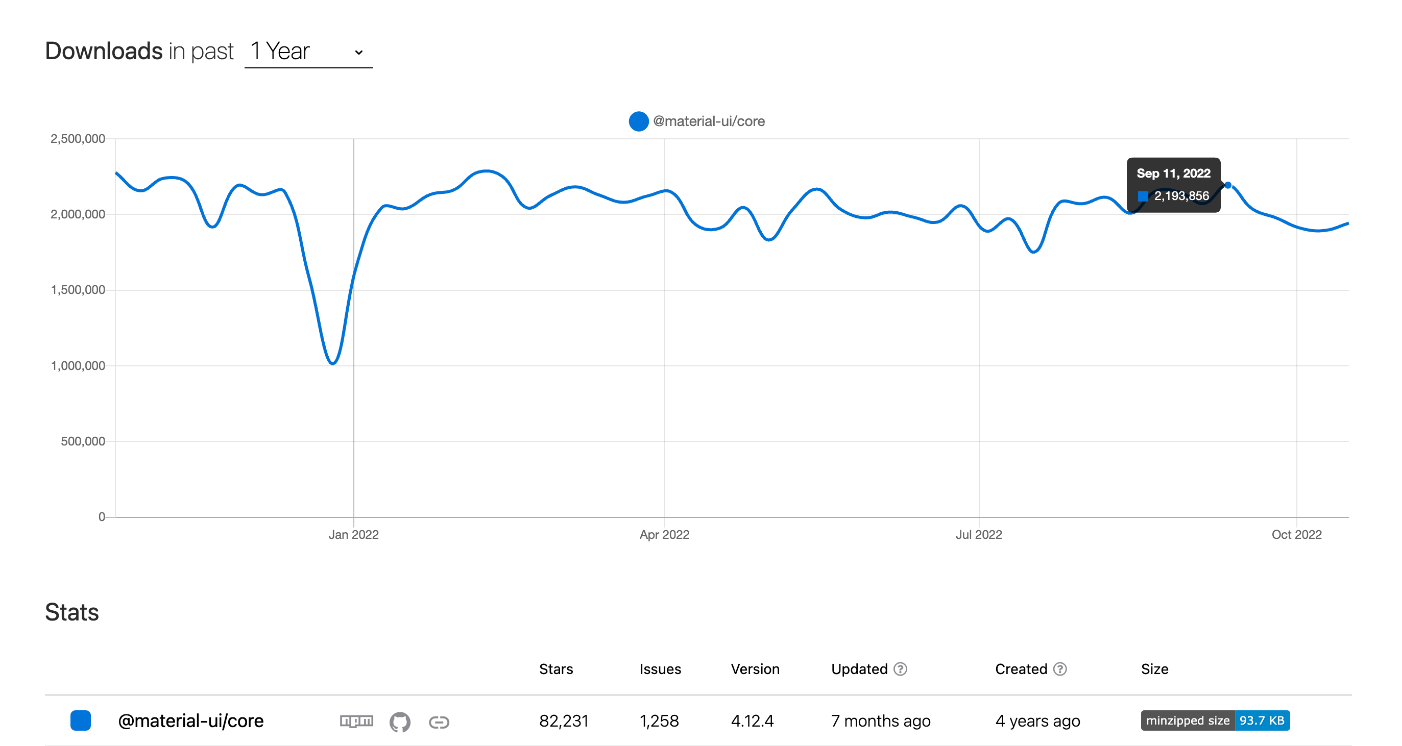
According to NPM trends, material UI has over 2 million weekly downloads with over 12k stars on Github. This means it is a preferred option for most developers.
Material UI Button Variants
The MUI button library has 3 variants you can choose from when creating your buttons.
- Text (Default)
- Contained
- Outlined
Each of them has different styles and is easily imported into React apps. We will explain how each of them works with sample code and screenshots.
Text Buttons
This button variant is used to create text-style buttons in the form of Link text. Below is an example code of text buttons with different colors. If you don’t specify a variant for your button, it will use the text variant as the default variant.

1 2 3 4 5 6 | <Button>Text</Button><Button variant="text" color="primary">Primary</Button><Button variant="text" color="secondary">Secondary</Button><Button variant="text" color="warning">Warning</Button><Button variant="text" color="success">Success</Button><Button variant="text" color="error">Error</Button> |
Contained Buttons
This is the traditional button most users are familiar with. It contains button text with an elevated background fill. They are also known as high-emphasis buttons. Below is an example of contained buttons.

1 2 3 4 5 | <Button variant="contained" color="primary">Primary</Button><Button variant="contained" color="secondary">Secondary</Button><Button variant="contained" color="warning">Warning</Button><Button variant="contained" color="success">Success</Button><Button variant="contained" color="error">Error</Button> |
Outlined Buttons
Outlined buttons look similar to the contained button. However, instead of a solid background, it has an outlined stroke that maintains the same color as the button text. Outlined buttons are also medium emphasis buttons. Below are examples of outlined buttons.

1 2 3 4 5 | <Button variant="outlined" color="primary">Primary</Button><Button variant="outlined" color="secondary">Secondary</Button><Button variant="outlined" color="warning">Warning</Button><Button variant="outlined" color="success">Success</Button><Button variant="outlined" color="error">Error</Button> |
Getting Started With Material UI Button
Requirements
Before creating material UI buttons, you need to have NPM installed on your machine. Additionally, you’ll need basic knowledge of JavaScript and React to follow along with the examples in this tutorial.
Installing React and Material UI
We’ll use the create-react-app package to bootstrap a new react app. To start, open your terminal window and navigate to the directory you wish to install React. Next, run the command below.
1 | npx create-react-app button-example |
After the installation completes, you’ll need to navigate into the project folder.
1 | cd button-example |
Inside this directory, you need to install the material UI library. For this, run the command below.
Npm:
1 | npm install @mui/material @emotion/react @emotion/styled |
Yarn:
1 | yarn add @mui/material @emotion/react @emotion/styled |
Material UI uses Emotion as its default styling engine. But you can also use Styled Component if you prefer the library.
Once the installation is complete, you can proceed to import the library into your react application. The Material UI button is a subset of material UI, a library for building UI faster with less code.
Now let’s create our first button. Copy and paste the code below into App.js to import the Button component.
1 | import Button from "@mui/material/Button"; |
The basic component usage is to add the <Button/> component into the App.js. Add the following code snippet into the return block of App.js.
1 2 3 4 5 6 7 | ...const App = () => { return ( <Button>Text</Button> );}... |
After adding the code, save the file and launch your dev server. You’ll see a basic button on your browser.

You can specify the variant using the “variant” prop.
1 2 3 | <Button variant="text">Text</Button><Button variant="outlined">Outlined</Button><Button variant="contained">Contained</Button> |

In the next section, we’ll show you the various customizations available with material UI buttons.
How to Customize a Button in MUI
Material UI has a lot of built-in customizations that make it easy to style your components. You can update your button’s color and text size with minimal code. We’ll explore various customization options here.
Note: The customizations in this tutorial follow material UI version 5. If you’d like to use material UI v4, check the MUI v4 documentation to learn more. Here is a video tutorial to help you get started.
[Embed: https://www.youtube.com/watch?v=1at8XzyeEVA]
How to Create a Reusable Button Component
To start, create a components folder within the src folder. After that, create a Button.js file. We’ll use this file to create a reusable button that we can customize in any component we use it.
Inside Button.js, copy and paste the code below.
1 2 3 4 5 6 7 8 9 10 11 12 | import Button from "@mui/material/Button";const ResuableButton = (props) => { return ( <Button variant={props.buttonVariant} color={props.buttonColor} > {props.buttonText} </Button> ) }export default ResuableButton; |
In the code snippet above, we import the Button component. Then create a ReusableButton component that accepts props. Next, we’ll use the props to set the values for the variant, color, and button text.
When you use this component, you’ll need to parse these parameters for it to work. We can reuse the component anywhere in our React App and update the colors and text.
First, we’ll import 2 components from the MUI library into App.js: The Stack and Container components.
The Stack component allows us to align buttons in rows or columns and add spacing between them.
The Container component serves as a wrapper for other components. It adds padding around on the left and right sides of the page. Similar to how React Bootstrap container works.
Next, let’s also import the ReusableButton component into App.js. For this, copy and paste the code below into App.js.
1 2 | import {Container, Stack} from "@mui/material";import ReusableComponent from "./components/Button"; |
Replace the App function with the code snippet below.
1 2 3 4 5 6 7 8 9 10 11 12 13 | function App() { // const classes = useStyles() return ( <Container> <Stack spacing={3} direction="row"> <ResuableButton buttonVariant="text" buttonColor="primary" buttonText="Text" /> </Stack> </Container> );}export default App; |
The code above uses the reusable button component. It needs 3 props: buttonVariant, buttonColor, and buttonText for setting the “variant”, “color”, and “button text” respectively.
We can reuse the component to test other features provided by material UI.
Button Colors
Material UI has theme colors you can include to add styles to buttons in your component. Below are the default theme colors MUI supports.
- Primary (Default)
- Secondary
- Success
- Warning
- Error
- Info
To add colors to buttons, we use the “color” prop and specify the palette you wish to use. We’ll demo some of the colors it supports below.
1 2 3 4 5 | <Stack spacing={3} direction="row"> <ResuableButton buttonVariant="text" buttonColor="primary" buttonText="Primary" /> <ResuableButton buttonVariant="outlined" buttonColor="primary" buttonText="Primary" /> <ResuableButton buttonVariant="contained" buttonColor="primary" buttonText="Primary" /></Stack> |

1 2 3 4 5 | <Stack spacing={3} direction="row"> <ResuableButton buttonVariant="text" buttonColor="secondary" buttonText="Primary" /> <ResuableButton buttonVariant="outlined" buttonColor="secondary" buttonText="Primary" /> <ResuableButton buttonVariant="contained" buttonColor="secondary" buttonText="Primary" /></Stack> |

1 2 3 4 5 | <Stack spacing={3} direction="row"> <ResuableButton buttonVariant="text" buttonColor="success" buttonText="Primary" /> <ResuableButton buttonVariant="outlined" buttonColor="success" buttonText="Primary" /> <ResuableButton buttonVariant="contained" buttonColor="success" buttonText="Primary" /></Stack> |

Feel free to try out other theme colors to see how they look.
Button Sizes
You can set sizes for MUI buttons using the “size” prop. MUI supports 3 button sizes by default.
- Small
- Medium (Default)
- Large
Let’s add the size prop to the ResuableButton component. Replace the Button component in Button.js with the code snippet below.
1 2 3 4 5 6 7 | <Button variant={props.buttonVariant} color={props.buttonColor} size={props.buttonSize}> {props.buttonText}</Button> |
After adding the size prop, head back to App.js and create a reusable button. We’ll use the buttonSize prop to set the button size this time.
1 2 3 | <ResuableButton buttonVariant="contained" buttonColor="warning" buttonSize="small" buttonText="small" /><ResuableButton buttonVariant="contained" buttonColor="success" buttonText="Medium" buttonSize="medium" /><ResuableButton buttonVariant="contained" buttonColor="info" buttonText="Large" buttonSize="large" /> |

Available Props
Material UI buttons have many props for customizing and extending the features in the button component. Below are the props supported by the MUI button.
- variant: For setting the preset of the button component
- children: It is the content of the button.
- classes: Used for extending buttons by adding theme or custom styles.
- size: It is used to customize the size of the button.
- fullWidth: Boolean for setting the button to display at full width.
- disabled: Boolean to make the button inactive.
- disableElevation: Boolean to disable elevated button design. The elevation is enabled by default on buttons.
- disableFocusRipple: The boolean value enables or disables the keyboard focus ripple effect.
- startIcon: To add an MUI icon before the button text.
- endIcon: Used to add MUI icon after button text.
- href: Achor text for adding links to buttons.
- color: For setting the color with theme colors
- disableRipple: Boolean to disable the ripple effect on buttons. By default, ripple effect is enabled on MUI buttons.
- sx: Prop for overriding system styles and adding custom styles to icons.
Custom Styling
You can override button styles and add custom styles to your buttons using the sx prop. Let’s add some styles to the button component.
1 2 3 4 5 6 7 8 9 10 11 12 13 | <Button variant="contained" color="error" sx={ { marginBottom: 10, marginTop: 10, background: '#9b51e0' } }>Custom Color</Button> |
Although we specified the color prop as “error”, we can override it and add custom colors.

How to Create a Button With an MUI Icon
You can create icon buttons as well as attach icons to regular buttons. MUI Icons uses the Google Fonts Icon library. This means you can use any icon from Google’s Icon Library.
The icon button also supports all the props in the Button component. Let’s see some examples below.
How to Create an Icon Button in MUI
To create an icon button, we use the IconButton component. First, you’ll need to import it into your app. You’ll also need to import the icons you’d use from the material icon library.
1 2 | import { IconButton, Stack } from '@mui/material';import { Settings, Info, ContentCopy, Favorite } from '@mui/icons-material'; |
Next, you can use the Icon button in the App component.
1 2 3 4 5 6 | <Stack spacing={2} direction="row"> <IconButton><Settings /></IconButton> <IconButton color="primary"><Favorite /></IconButton> <IconButton color="secondary"><Info /></IconButton> <IconButton disabled color="primary"><ContentCopy /></IconButton></Stack> |
In between the IconButton component, you’ll need to enter the Icon you imported from the icons library.

Props available in the regular button component also apply to IconButtons. This means you can change the variant, disable elevation, update icon sizes, etc.
How to Create a Button with an Icon and Label
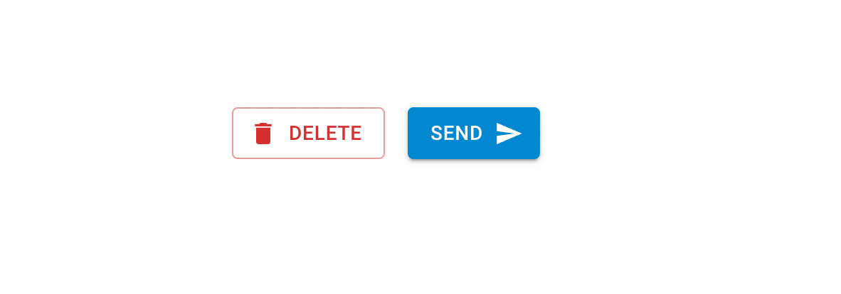
With the startIcon and endIcon props, you can specify the icons you want to display before and after the button component. You’ll need to import the Icon from the Icons library before adding it to the prop.
1 2 3 4 5 6 7 8 9 10 11 12 13 14 15 16 | <Stack spacing={2} direction="row"> <Button variant="outlined" color="error" startIcon={<Delete />} > Delete </Button> <Button variant="contained" color="info" endIcon={<Send />} > Send </Button> </Stack> |
Handling Material UI Button Click Event
One good feature of MUI buttons is that it supports standard JS props for handling events. You can use the onClick event handler to control button clicks.
1 | <Button variant="outlined" color="error" onClick={() => alert('You clicked me!!!')}>Click Me</Button> |

Like we mentioned earlier in this tutorial, MUI button is part of the Material UI library. Check out the video below to learn about Typography in Material UI.
[Embed: https://www.youtube.com/watch?v=r42jcDXSFM0&list=PLC3y8-rFHvwh-K9mDlrrcDywl7CeVL2rO&index=3]
Material UI vs React Bootstrap
Material UI and React Bootstrap are libraries for creating React components faster with minimal CSS customization.
However, Material UI is a preferred option because it is beginner-friendly and comes with lots of customization and theme colors, making building with React easy.
Below is a comparison chart between both libraries from NPM trends.
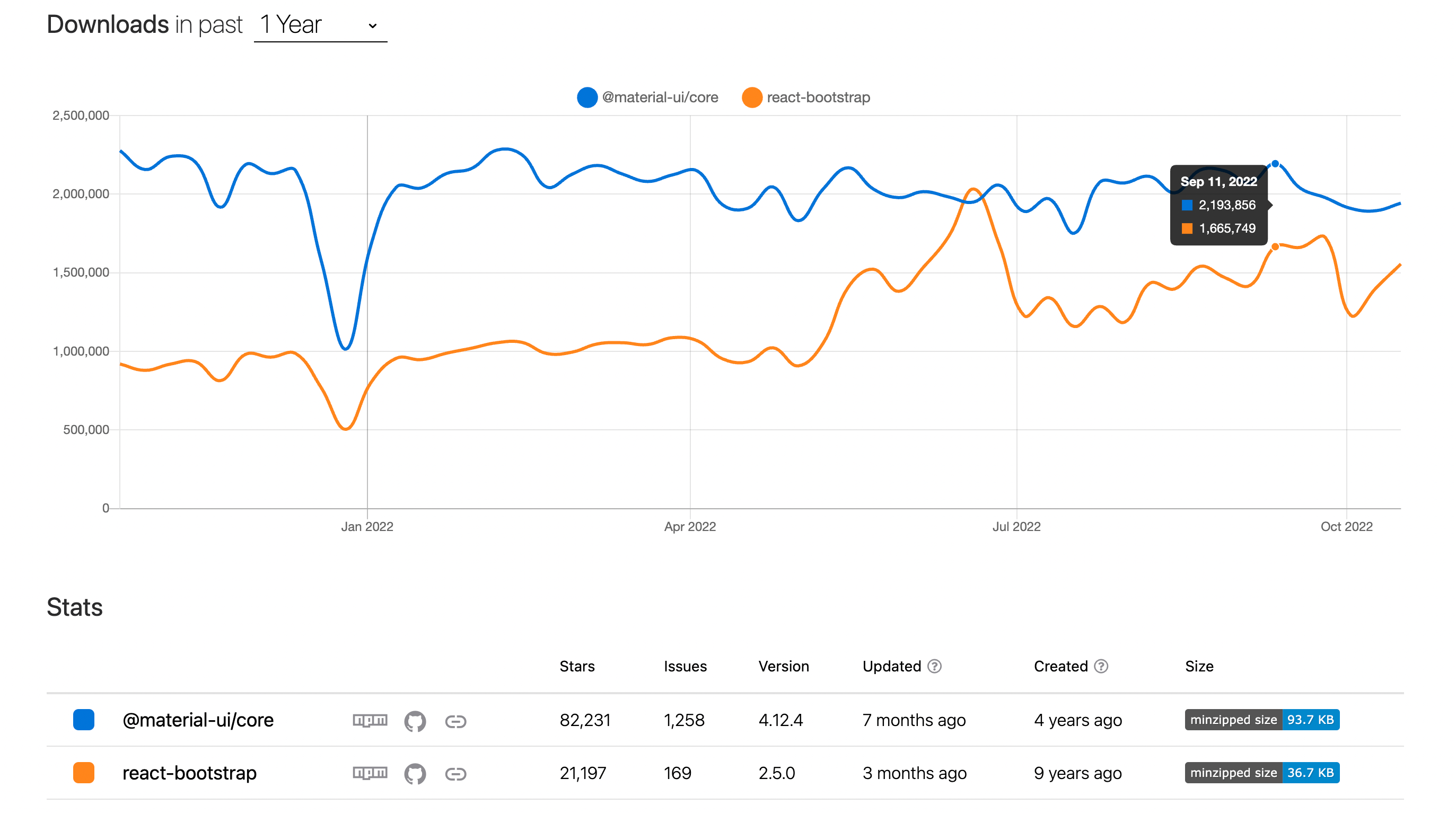
From the chart above, it is evident that Material UI has more star ratings on GitHub and gets more weekly downloads. This speaks a lot about MUI being a preferred library for most developers.
Another cool feature of the MUI library is that you can easily create a dark theme for your project. Other libraries require some additional setup to create dark and light themes.
Material UI Alternatives
Although material UI is one of the most popular libraries for building UI faster, other alternatives are equally efficient and beginner friendly. Below are some libraries for building UI and creating buttons in React.
Conclusion
Buttons are essential when building a web application. You can use them to emphasize a text, such as submitting a form or posting a blog post.
This article introduced the MUI button component and explained how to add and customize it in React, including outlined buttons, contained buttons, and more.
For more React tutorials, be sure to check out our blog. You may also check our comparison of the top 10 CSS frameworks.
Ready to build React components faster? Get started with CopyCat’s Figma to React builder. Our tool analyzes your team’s Figma design and generates production-level code snippets for your components.

