- Introduction
- What are Dialogs?
- Setting Up a React App
- Creating React Dialog Component
- Material-UI Dialog Component DOM Elements
- Material UI Dialog Props
- Dialog onBackdropClick
- Dialog onClose
- Dialog disableEscapeKeyDown
- Dialog PaperComponent
- Dialog PaperProps
- Dialog Scroll
- Dialog BackdropComponent
- What is the Modal component?
- What is the Difference between the Menu, Popover, and Drawer components?
- What is the Difference between the Modal and Dialog component?
- Wrapping Up
Do you want to be more efficient? Consider CopyCat, an AI-powered plugin that will convert your Figma design to UI code, allowing you to concentrate on the app’s business logic.
Introduction
Material UI is an open-source React component library that implements Google’s Material Design. A component library is a collection of components unified with a common purpose. Other examples include: React Bootstrap, Chakra UI, Semantic UI React, etc.
One of the major advantages of using a component library is reducing development time. As we will see later on, instead of having to build components from scratch, they can easily be imported from a component library.
In this tutorial, you’ll learn about the Material UI Dialog component for creating interactive dialog in a React application.
What are Dialogs?
A dialog is a type of modal that appears in front of the web page’s content to offer important information or ask for a decision. When it appears, dialog disables all app functionality and they stay on the screen until confirmed, dismissed, or a necessary action is made. Its primary role is to get an action from a user. It can work with event handlers and can take dialog children that can be rendered within it.
We will be looking into creating a dialog with React.
Setting Up a React App
React is a free and open-source front-end JavaScript library for building user interfaces based on UI components. In other words, the user interface built with React is a collection of components. React is maintained by Meta and a community of individual developers.
There are several ways to create a react app, we will be using the create-react-app method. This is done by running the following command in your terminal/command prompt. “project_name” should be the name of the project folder.
1 | npx create-react-app project_name |
After successfully running the command, the next thing is to change the directory into the project folder and start the app with npm start
1 2 | cd project_namenpm start |
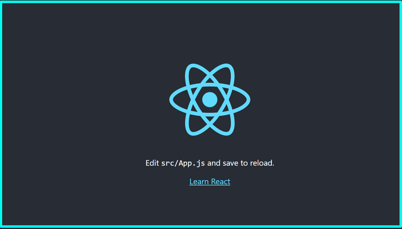
If the steps above were followed accurately, you should get the popular react welcome page below.
1 2 3 4 5 6 7 8 9 10 11 12 13 14 15 16 17 18 19 20 21 22 23 24 25 | import logo from './logo.svg';import './App.css';function App() { return ( <div className="App"> <header className="App-header"> <img src={logo} className="App-logo" alt="logo" /> <p> Edit <code>src/App.js</code> and save to reload. </p> <a className="App-link" target="_blank" rel="noopener noreferrer" > Learn React </a> </header> </div> );}export default App; |
Next, let’s look into how to create a modal component
Creating React Dialog Component
In this section, we will be looking into creating a react component dialog using the Material UI Dialog component. The modal will be for confirmation dialog. All you need is a basic understanding of React.
The first step is to add material UI and its other dependencies to the project. This can be done with the code snippet below.
1 | npm install @mui/material @emotion/react @emotion/styled |
The next step is to create a file called ConfirmNotification. This can be called anything, but it should be in camel case and the first letter must be capitalized. Also, it is strongly advised to use descriptive names.
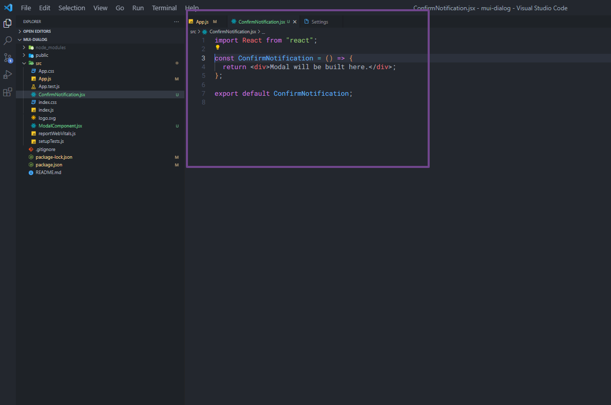
Next, in the new file just created, an arrow function template is created. This is where the dialog will be created.
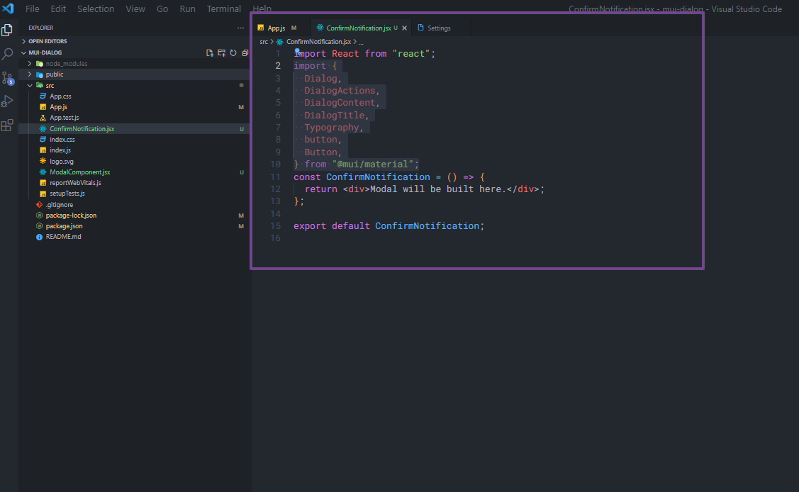
After that, some of the components that will be used in the dialog are imported from Material UI Library.
From the components imported, the Dialog component is the main container, it wraps around every other component and takes in a open prop set to true, which makes the dialog visible by default.
This is followed by a DialogTitle component, which could be the title of the dialog, a confirmation notification in this case.
Then followed by the DialogContent component, which is the area where the dialog content will be. In this example, it will have two Typography elements with the text to be displayed.
Next is the DialogActions, which will have two buttons to either decline or confirm the action.
1 2 3 4 5 6 7 8 9 10 11 12 13 14 15 16 17 18 19 20 21 22 23 24 25 26 27 28 29 30 31 32 33 34 35 | import React from "react";import { Dialog, DialogActions, DialogContent, DialogTitle, Typography, Button,} from "@mui/material";const ConfirmNotification = () => { return ( <Dialog open={true}> <DialogTitle> {" "} <Typography variant="h4">Lorem ipsum dolor sit amet consectetuer</Typography> </DialogTitle> <DialogContent> <Typography variant="h6"> Are you sure you want to delete this user? </Typography> <Typography variant="subtitle2"> You can't undo this operation </Typography> </DialogContent> <DialogActions> <Button variant="contained">No</Button> <Button variant="contained" color="error"> Yes </Button> </DialogActions> </Dialog> );};export default ConfirmNotification; |
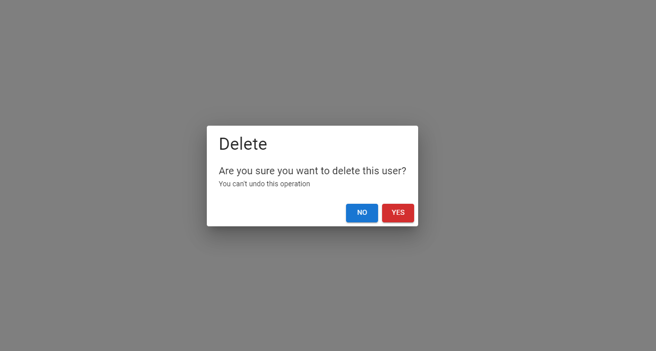
The next thing to do is import the ConfirmNotification component into the App file. As an illustration, a confirmation dialog can now be seen below:
1 2 3 4 5 6 7 8 9 10 11 12 13 | import { useState } from "react";import "./App.css";import ConfirmNotification from "./ConfirmNotification";function App() { return ( <div className="App"> <ConfirmNotification /> </div> );}export default App; |
When you visit your browser, below will be the output of the component above:
Material-UI Dialog Component DOM Elements
To establish a better understanding of the Material-UI dialog, we need to talk about its DOM Element (Document Object Model). That is the Backdrop, Container, and Paper. These should not be confused with the components that are passed as props.
The Backdrop, as the name implies, acts as the overlay on which the main part of the modal window is displayed.
The Paper is also just a simple internal background where the elements of the dialog will be rendered.
Material UI Dialog Props
Material UI Dialog accepts several props like open (this was used earlier to make the modal display), BackdropComponent, disableEscapeKeyDown, onClose, PaperProps, and fullWidth props, etc.
In this section, we will next look into some of the above-mentioned props.
Dialog onBackdropClick
The onBackdropClick is a callback that is fired when the backdrop is clicked. Its primary role is to trigger a function that closes the dialog. It does the job of a close button.
As of the time of writing this article, according to material UI docs, onBackdropClick has been deprecated. The onClose prop should be used instead. Correspondingly, we will talk about the onClose prop in next the next section.
Dialog onClose
The onClose prop is a callback that is triggered when the dialog backdrop is clicked. As stated earlier, it has replaced the onBackdropClick prop. It can be used to trigger a function when the backdrop is clicked. It is mostly used to cancel the dialog.
In the code snippet below, the onClose is used to close the modal. A useState hook was introduced to create a state for whether it is open or not.
1 2 3 4 5 6 7 8 9 10 11 12 13 14 15 16 17 18 19 20 21 22 23 24 25 26 27 28 29 30 31 32 33 34 35 36 | import React, { useState } from "react";import { Dialog, DialogActions, DialogContent, DialogTitle, Typography, Button,} from "@mui/material";const ConfirmNotification = () => { const [isOpen, setIsOpen] = useState(true); //NEW STATE INTRODUCED return ( <Dialog onClose={() => setIsOpen(false)} open={isOpen}> <DialogTitle> {" "} <Typography variant="h4">Delete</Typography> </DialogTitle> <DialogContent> <Typography variant="h6"> Are you sure you want to delete this user? </Typography> <Typography variant="subtitle2"> You can't undo this operation </Typography> </DialogContent> <DialogActions> <Button variant="contained">No</Button> <Button variant="contained" color="error"> Yes </Button> </DialogActions> </Dialog> );};export default ConfirmNotification; |
Dialog disableEscapeKeyDown
This prop takes the value of type boolean (true or false). It is false by default and if set to true, pressing the escape (Esc) button on your keyboard will not trigger the onClose callback, hence the modal will stay open.
Dialog PaperComponent
The Dialog PaperComponent prop is used to render the dialog component. This is the area where all the elements in the dialog are rendered. An example will be given further down to shed more light on this.
Dialog PaperProps
These are props that are applied to the paper component mainly to style it. It could be to change the width or background color.
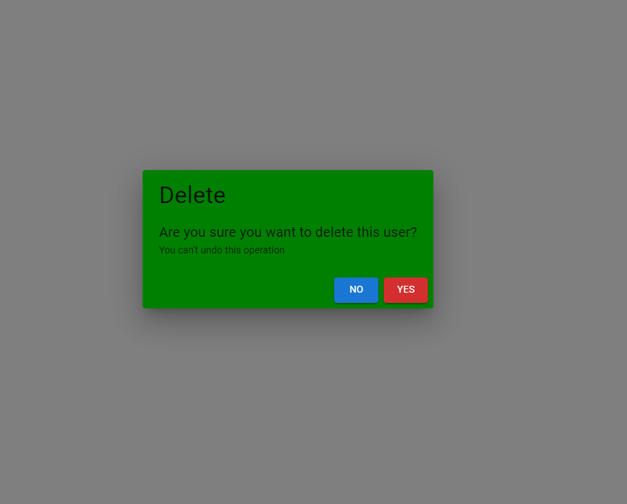
In the example below, the color of the dialog is to be changed to green. This can be done using the PaperComponent and passing the appropriate PaperProps prop to it.
The first thing is to import Paper and styled. The prop is created as StyledPaper and passed into the PaperComponent as shown below:
1 2 3 4 5 6 7 8 9 10 11 12 13 14 15 16 17 18 19 20 21 22 23 24 25 26 27 28 29 30 31 32 33 34 35 36 37 38 39 40 41 42 43 44 45 46 | import React, { useState } from "react";import { Dialog, DialogActions, DialogContent, DialogTitle, Typography, Button, Paper,} from "@mui/material";import { styled } from "@mui/material/styles";const ConfirmNotification = () => { const [isOpen, setIsOpen] = useState(true); const StyledPaper = styled(Paper)` background-color: green; `; return ( <Dialog onClose={() => setIsOpen(false)} open={isOpen} disableEscapeKeyDown={true} PaperComponent={StyledPaper} > <DialogTitle> {" "} <Typography variant="h4">Delete</Typography> </DialogTitle> <DialogContent> <Typography variant="h6"> Are you sure you want to delete this user? </Typography> <Typography variant="subtitle2"> You can't undo this operation </Typography> </DialogContent> <DialogActions> <Button variant="contained">No</Button> <Button variant="contained" color="error"> Yes </Button> </DialogActions> </Dialog> );};export default ConfirmNotification; |
The component above will produce a dialog component with a green background color, as shown below:
Dialog Scroll
This is used when the contents displayed in a dialog are longer than the screen of users. This can either be scroll=paper which scrolls within the paper element or scroll =body scrolls within the body element.
Dialog BackdropComponent
The Backdrop component is used to provide emphasis on a particular element or parts of it. This signal a states change to users and it’s particularly useful when building dialogs. According to Material Ui Library, this has been depreciated. It is advised to use slots.backdrop.
FAQ
What is the Modal component?
The modal component offers a solid basis for building dialogs, popovers, and other types of user interface elements. The component is a lower-level construct that is made possible by the following elements: Dialog, Drawer, Menu, and Popover.
What is the Difference between the Menu, Popover, and Drawer components?
Menu: A menu displays a list of choices on a temporary surface. It appears when the user interacts with a button or other control.
Popover: A Popover can be used to display some content on top of another.
Drawer: Navigation drawers provide access to destinations in your app.
What is the Difference between the Modal and Dialog component?
Modals can be used for a whole lot. For example, from using drawers as sidebar navigation, menus to display dropdown information, and popover to create tooltip components, etc.
While Dialog like the other elements mentioned above, the dialog is made by leveraging the modal component. Let’s take a closer look at the dialogs component below.
A dialog is a particular kind of modal window that appears in front of the app’s content to offer important information or solicit input.
It provides users with information about a task and may also demand them to make decisions or perform several activities.
When it displays, it immediately turns off all app functioning and stays on screen until it is acknowledged, dismissed, or a necessary action is made. They should only be used in moderation because they are designed to interrupt.
It is worth noting that all dialogs are a form of modal but not all modals are dialogs as we have demonstrated in this article.
Wrapping Up
Material UI is a really extensive library and dialog is just one of the awesome components present in the library.
If you have ever tried to create models from scratch you will be familiar with the difficulties involved. Having to write extensive CSS while trying to get the transition to be perfect from one screen size to the other. But with MUI dialog, there is rarely any reason to write CSS extensively.
If you prefer a video tutorial on Material UI Tabs Component, watch the tutorial by Codevolution below:
Finally, more articles like this can be found on our CopyCat blog. CopyCat converts your Figma files into a ready-to-use React project, saving you over 35% of development time. You can also check out CopyCat here.
Interesting Reads From Our Blogs
- How to Create Forms in React Using Material UI Form Component
- A Great Guide To Using Material UI Textfield Efficiently
- Creating a Dropdown Selection in React Using Material UI Select
Happy Coding


