- What is React Suspense?
- What is React Suspense Error Boundary?
- What is a React Fallback UI?
- React Suspense vs Error Boundary Component Table.
- Creating a New React Project
- Creating a React Suspense Fallback UI
- Using the React Suspense Fallback UI
- Creating an Error Boundary Component
- Creating an Error Boundary Fallback UI
- Applying ErrorBoundary to React App
- Data Fetching with React Suspense
- What does React Suspense lets you do and what does it not?
- React Suspense Frequently Asked Questions
- Why Do We Use Suspense in React?
- What is Race Condition?
- Is suspense in React 18?
- What Is Suspense in React 18?
- Which React has suspense?
- What is fallback used for in suspense?
- Can I use suspense React?
- Is React suspense experimental?
- Is React suspense a data fetching library?
- How does suspense work in React?
- What's the difference between React Lazy and Suspense?
- What’s fetch-on-render?
- What’s fetch-then-render
- What’s render-as-you-fetch
- Wrapping Up
Handling data fetching can be tedious with a lot of loading states to manage in a React component, and most of the time, they’re not implemented properly which might cause the app to crash. To address this issue, the React team created a feature called suspense in React version 16.6.
In this article, we’re going to explore what is a React Suspense, a React Suspense Fallback UI, and how to use them in your React applications.
This tutorial also assumes you have a working knowledge of React and how to create React components. You can learn about React components here before continuing with this tutorial.
What is React Suspense?
React suspense is a ReactJS technique that enables data fetching libraries to inform React when asynchronous data for a component is still being fetched. It suspends the component from rendering until the required data is obtained and provides a fallback UI during the fetch duration.
What is React Suspense Error Boundary?
Error boundaries are class components in React apps that catch JavaScript errors anywhere within their child component, log the error for the developer, and render a fallback UI for the user.
For instance, when an error occurs while fetching data in a component that uses suspense, the error boundary displays a fallback UI.
What is a React Fallback UI?
A React fallback UI is a component rendered when an error occurs within React component tree or when a component is suspended due to a network request for data that is asynchronous.
Examples of React Fallback UI
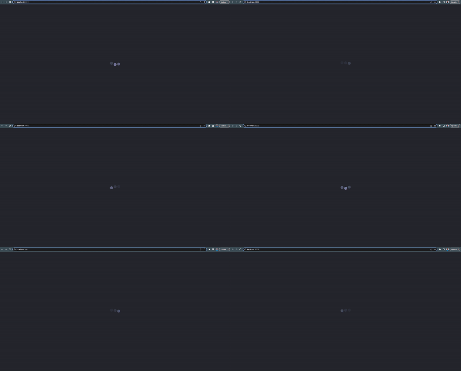
A fallback UI example for a suspense page component:
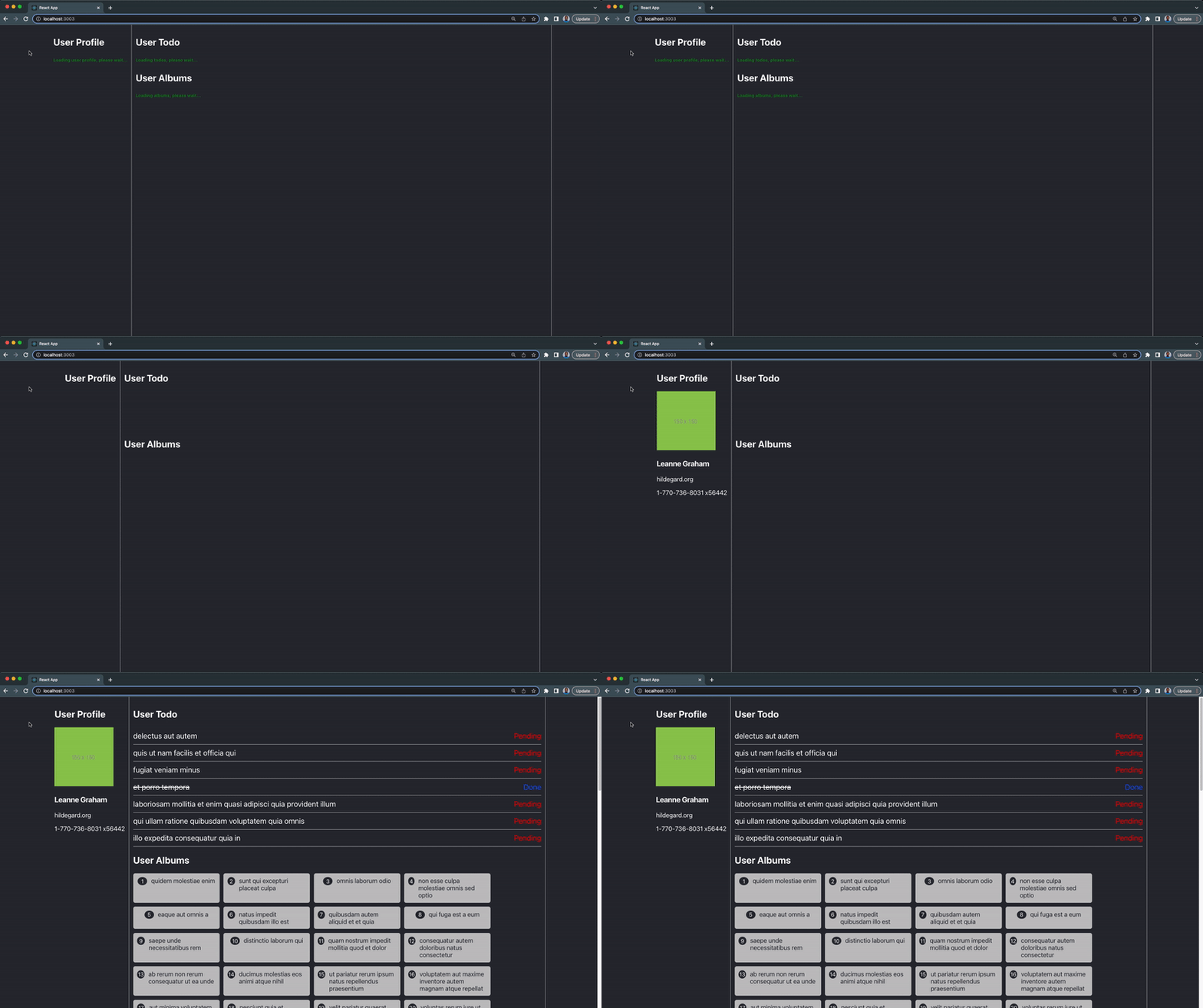
An example of a fetch fallback UI for multiple suspense components:
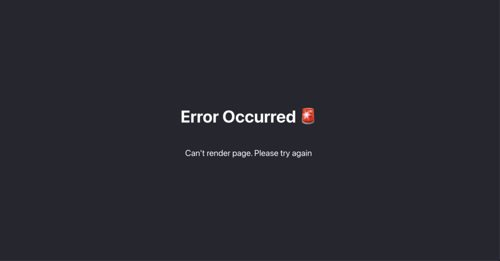
An example of a rendering error fallback UI for error boundary:
We can have as many error boundaries in our React app but it’s best to be intentional about their placement.
React Suspense vs Error Boundary Component Table.
The following table shows the differences and similarities between React suspense and error boundary:
| React Suspense | Error Boundary |
|---|---|
| React Component | React Component |
| Used to handle component’s fetching errors | Used to handle component’s rendering errors |
| Has fallback component option | Has fallback component option |
Creating a New React Project
To demonstrate how suspense works in React project, we’ll create a new react app named user-dashboard to experiment. This tutorial makes use of CRA (Create React App).
Create a new React user-dashboard application with the command below:
1 | npx create-react-app user-dashboard |
Navigate into the newly created user-dashboard directory:
1 | cd user-dashboard |
Next, start the React app server:
1 | npm run start |
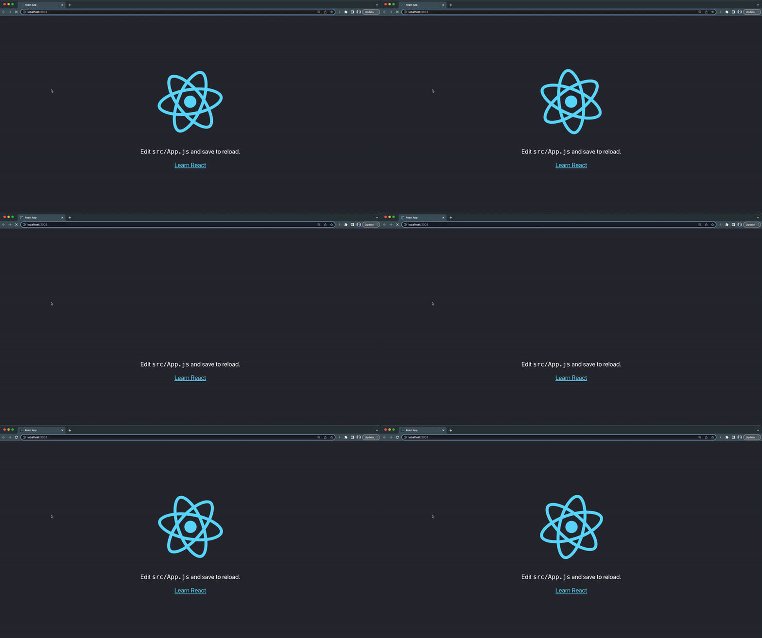
Your React app will open a new tab on your browser and should look something like this:
Creating a React Suspense Fallback UI
We’ll create a suspense fallback UI for our React app, this fallback UI will be rendered before our component is fully ready to be rendered.
In the src folder:
- Create a new component folder
- Inside the component folder, create a new loader folder
- Next, create a new AppLoader.jsx file inside loader folder ******with the following lines of code:
1 2 3 4 5 6 7 8 9 10 11 12 13 14 | import React from "react";import "./app-loader.css";export const AppLoader = () => { return ( <section className='app-loader'> <div className='bouncing-loader'> <div></div> <div></div> <div></div> </div> </section> );}; |
- Create a new app-loader.css file with the following CSS code:
1 2 3 4 5 6 7 8 9 10 11 12 13 14 15 16 17 18 19 20 21 22 23 24 25 26 27 28 29 30 31 32 33 34 35 36 37 38 39 40 41 | .app-loader { position: fixed; top: 0; left: 0; width: 100%; height: 100%; z-index: 9999; display: flex; justify-content: center; align-items: center; background-color: #282c34;}.bouncing-loader { display: flex; justify-content: center;}.bouncing-loader > div { width: 1.5rem; height: 1.5rem; margin: 3rem 0.2rem; background: #8385aa; border-radius: 50%; animation: bouncing-loader 0.6s infinite alternate;}.bouncing-loader > div:nth-child(2) { animation-delay: 0.2s;}.bouncing-loader > div:nth-child(3) { animation-delay: 0.4s;}@keyframes bouncing-loader { to { opacity: 0.1; transform: translate3d(0, -1rem, 0); }} |
- Our AppLoader component should look something like this:
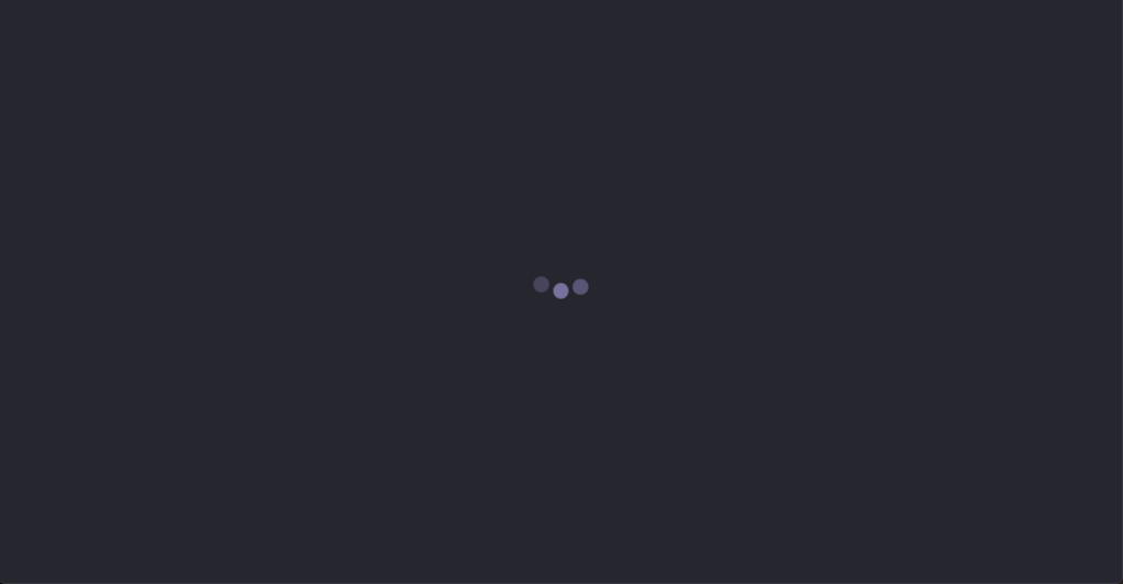
We’ll set up our suspense component and render the AppLoader fallback UI in the next section.
Using the React Suspense Fallback UI
Step 1:
Import suspense from the react library inside your index.js file:
1 | import React, { Suspense } from "react"; |
Step 2:
Convert App import to dynamic import using lazy loading. Like this:
1 2 3 | // import App from "./App";const App = React.lazy(() => import("./App")); |
Step 3:
Comment out the regular import expression. You can read more about React lazy loading data and code splitting here.
Step 4:
Import AppLoader inside your index.js file:
1 | import { AppLoader } from "./component/loader/AppLoader"; |
We can now apply suspense to our whole app, by wrapping the App component inside the index.js file with the suspense component like this:
1 2 3 | <Suspense fallback={<AppLoader />}> <App /></Suspense> |
From the piece of code above, we’re setting our suspense fallback option to the AppLoader component, the AppLoader component will be rendered until the App component is fully ready to be rendered.
We can see this in action by reloading our browser:
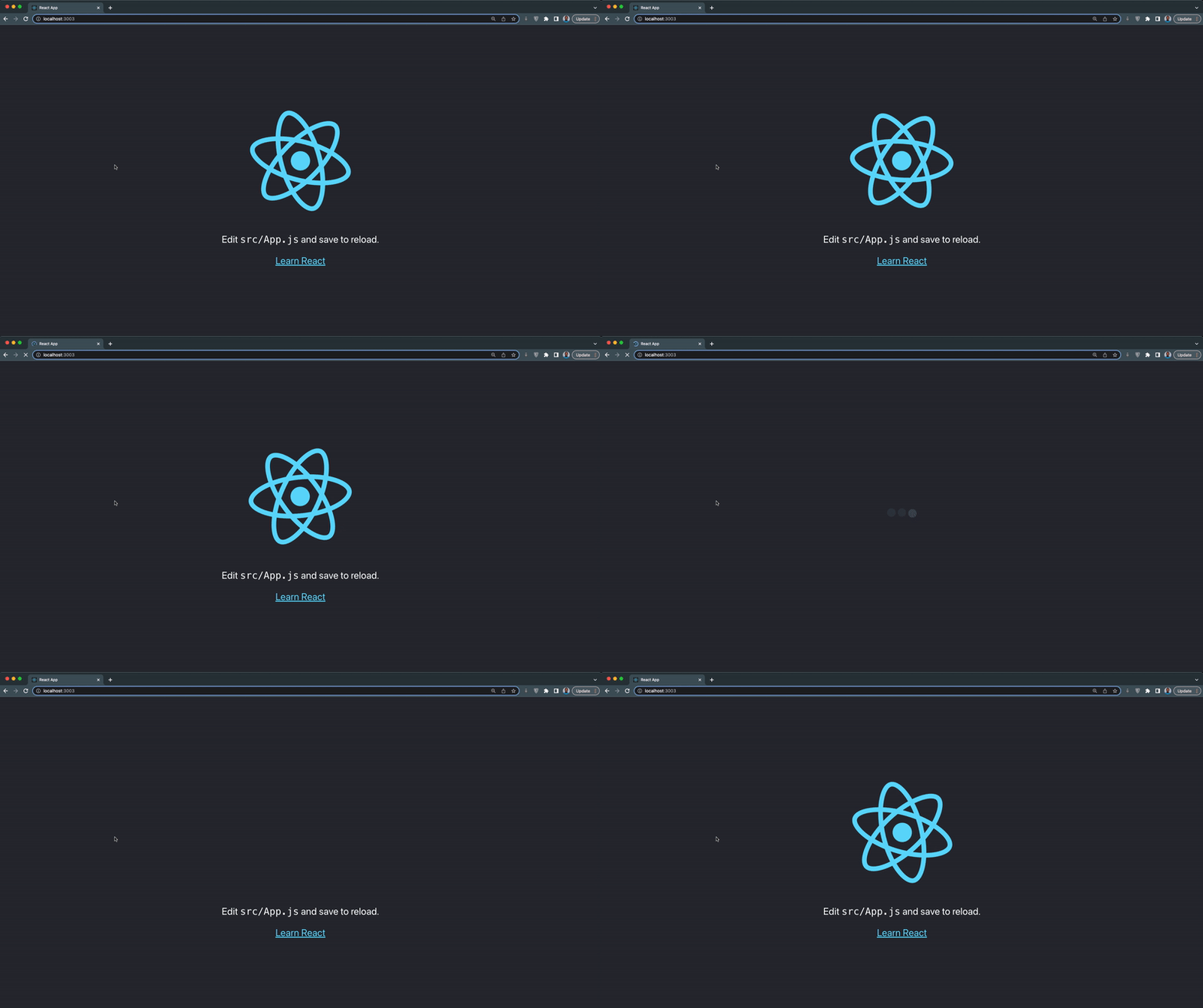
The suspense component handles the loading state of the App or any component and will render the fallback UI while loading is true.
Note: This tutorial uses the slow 3g throttling in chrome. Learn how to turn it on here.
Creating an Error Boundary Component
In this section, we’ll create an error boundary component for handling errors in our components. The error boundary component will handle both rendering errors and errors from suspense data fetching.
In the component folder:
- Create a new error-boundary folder
- Next, create a new ErrorBoundary.jsx file inside the error-boundary folder with the following lines of code:
1 2 3 4 5 6 7 8 9 10 11 12 13 14 15 16 17 18 19 20 | import React from "react";// Error boundaries currently have to be a class component.class ErrorBoundary extends React.Component { state = { hasError: false, error: null }; static getDerivedStateFromError(error) { return { hasError: true, error, }; } render() { if (this.state.hasError) { return this.props.fallback; } return this.props.children; }}export default ErrorBoundary; |
The above piece of code is what an ErrorBoundary custom component looks like, and it can only be written in a React class component.
Creating an Error Boundary Fallback UI
In this section, we’ll create an error boundary fallback UI for our React app, this fallback UI will be rendered when an error occurs within our App component.
In the error-boundary folder:
- Create a new ErrorPage.jsx file with the following lines of code:
1 2 3 4 5 6 7 8 9 10 | import React from "react";import "./error-page.css";export const ErrorPage = () => { return ( <div className='error-page'> <h1>Error Occurred <img draggable="false" role="img" class="emoji" alt=" src="https://s.w.org/images/core/emoji/15.0.3/svg/1f6a8.svg"></h1> <p>Can't render page. Please try again</p> </div> );}; |
Next, create a new error-page.css file with the following lines of CSS:
1 2 3 4 5 6 7 8 9 10 11 | .error-page { display: flex; flex-direction: column; align-items: center; justify-content: center; text-align: center; background-color: #282c34; min-height: 100vh; color: white; font-size: calc(10px + 2vmin);} |
Applying ErrorBoundary to React App
Now that we have our ErrorBoundary component and ErrorPage component setup, we can now apply the error boundary to our App component.
Import the ErrorBoundary and ErrorPage components inside the index.js file, like this:
1 2 | import ErrorBoundary from "./component/error-boundary/ErrorBoundary";import { ErrorPage } from "./component/error-boundary/ErrorPage"; |
Next, wrap the Suspense component with the ErrorBoundary component as shown below:
1 2 3 4 5 | <ErrorBoundary fallback={<ErrorPage />}> <Suspense fallback={<AppLoader />}> <App /> </Suspense></ErrorBoundary> |
From the above code:
- Both the ErrorBoundary and Suspense components have a fallback option.
- Ensure the ErrorBoundary is wrapped around the suspense component to catch errors that occur within the suspense data fetching.
To see our ErrorBoundary in action, we can throw an error within the App component like this:
1 2 3 4 5 6 7 8 9 10 | function App() { // throw an error to test the error boundary throw new Error("Error occurred"); return ( // JSX goes here)}export default App; |
This line of code will crash our App component and display the error boundary fallback UI, as demonstrated below:

Without an error boundary, our App will crash and render a blank page with errors in the console.
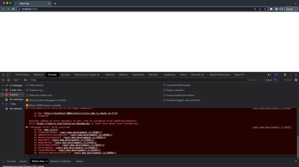
This is not good for the user experience.
Data Fetching with React Suspense
In this section, we’ll look at how we can use React suspense in a data fetching component.
To demonstrate this, we’re going to build a simple user dashboard that fetches data from different endpoints and renders them on the UI.
You can find the complete source code for this tutorial in this repository.
Step 1 – Creating the User Profile Component
We’re going to fetch user data and a profile picture from JSONPlaceholder mock endpoint.
In the component folder:
- Create a new dashboard folder
- Next, create a new UserProfile.jsx and user-profile.css inside the dashboard folder
- Copy and paste the code below inside the UserProfile.jsx file:
1 2 3 4 5 6 7 8 9 10 11 12 13 14 15 16 17 18 19 20 21 22 23 24 25 26 27 28 29 30 31 32 33 34 35 36 37 38 39 40 41 42 43 44 45 46 47 48 49 50 51 | import React, { useEffect } from "react";import "./user-profile.css";const UserProfile = () => { const [user, setUser] = React.useState(null); const [profileImage, setProfileImage] = React.useState(null); useEffect(() => { fetchUserById(); fetchProfileImage(); }, []); const fetchProfileImage = async () => { try { const response = await fetch( ); const profileImage = await response.json(); console.log(profileImage.url); return setProfileImage(profileImage.thumbnailUrl); } catch (error) { return console.log(error); } }; const fetchUserById = async () => { try { const response = await fetch( `https://jsonplaceholder.typicode.com/users/1` ); const user = await response.json(); return setUser(user); } catch (error) { return console.log(error); } }; return ( <> {user && ( <section> <img alt={user.name} src={profileImage} /> <h3 className='name'>{user.name}</h3> <p className='website'>{user.website}</p> <p className='phone'>{user.phone}</p> </section> )} </> );};export default UserProfile; |
- Copy and paste the following CSS code inside your user-profile.css file:
1 2 3 4 5 6 7 8 9 10 11 12 13 14 15 16 17 18 19 20 21 22 23 24 25 26 27 28 29 30 31 32 33 34 35 36 37 38 39 | ul { padding: 0;}li { list-style: none; padding: 0; margin: 0; display: flex; justify-content: space-between; align-items: center; border-bottom: 1px solid #ccc; padding: 10px 0; font-size: 1.2rem;}.name { font-size: 1.2rem;}.website { font-size: 1rem;}.phone { font-size: 1rem;}.red-text { color: red;}.blue-text { color: blue;}.line-through { text-decoration: line-through;} |
Step 2 – Creating the User Todo Component
This component will fetch a mock todo data from the JSONPlaceholder mock endpoint, we’ll render this as a todo list on our user’s dashboard as well.
In the dashboard folder:
- Create a new UserTodo.jsx and user-todo.css file
- Copy and paste the code below inside your UserTodo.jsx file:
1 2 3 4 5 6 7 8 9 10 11 12 13 14 15 16 17 18 19 20 21 22 23 24 25 26 27 28 29 30 31 32 33 34 35 36 37 38 39 40 41 42 43 44 45 46 47 | import React, { useEffect } from "react";import "./user-todo.css";const TodoList = () => { const [todos, setTodos] = React.useState(null); const fetchUserTodos = async () => { try { // delay for demo purposes const response = await fetch( ); const user = await response.json(); return setTodos(user); } catch (error) { return console.log(error); } }; useEffect(() => { // delay for demo purposes fetchUserTodos(); }, []); return ( <div className='todo-container'> <ul> {todos?.slice(0, 7)?.map(({ id, title, completed }) => { return ( <li key={id}> <span className={`${completed && "line-through"}`}>{title}</span> <span className={`todo-status ${ completed ? "blue-text" : "red-text" }`} > {completed ? "Done" : "Pending"} </span> </li> ); })} </ul> </div> );};export default TodoList; |
- Copy and paste the CSS code below inside your user-todo.css file:
1 2 3 4 5 6 7 8 | .todo-container{ min-height: 100px;}.todo-status{ display: inline-block; margin-left: 30px;} |
Step 3 – Creating the User Albums Component
The last data fetching component is a user album component that’ll fetch data from the JSONPlaceholder endpoint and render it on the user dashboard.
In the dashboard folder:
- Create a new UserAlbum.jsx and user-album.css file.
- Copy and paste the following lines of code inside the UserAlbum.jsx file:
1 2 3 4 5 6 7 8 9 10 11 12 13 14 15 16 17 18 19 20 21 22 23 24 25 26 27 28 29 30 31 32 33 34 35 36 37 38 | import React, { useEffect } from "react";import "./user-albums.css";const UserAlbums = () => { const [albums, setAlbums] = React.useState(null); const fetchUserAlbums = async () => { try { const response = await fetch( ); const albums = await response.json(); return setAlbums(albums); } catch (error) { return console.log(error); } }; useEffect(() => { fetchUserAlbums(); }, []); return ( <> <section className='album-section'> {albums?.map(({ id, title }) => { return ( <div className='album-card' key={id}> <span className='album-id'>{id}</span> <span>{title}</span> </div> ); })} </section> </> );};export default UserAlbums; |
- Copy and paste the following CSS code inside the user-album.css file:
1 2 3 4 5 6 7 8 9 10 11 12 13 14 15 16 17 18 19 20 21 22 23 24 25 26 27 28 29 | .album-section{ display: flex; flex-wrap: wrap; gap: 10px;}.album-card{ background-color: #c2c2c2; color: #282c34; display: inline; padding: 10px; border-radius: 5px; width: 200px; display: flex; justify-content: center; align-items: flex-start;}.album-id{ display: inline-block; margin-right: 10px; background: #282c34; border-radius: 50%; color: white; padding: 2px; width: 20px; text-align: center; font-size: 14px;} |
Step 4 – Rendering The Data Fetching Components on The Dashboard
Now that we have all our components ready, we’ll render them in the UserDashboard component.
In the dashboard folder:
- Create a new UserDashboard.jsx and user-dashboard.css file.
- Next, copy and paste the following lines of code inside the UserDashboard.jsx file:
1 2 3 4 5 6 7 8 9 10 11 12 13 14 15 16 17 18 19 20 21 22 23 24 25 26 27 28 29 30 31 32 33 34 35 36 37 38 39 40 41 42 43 44 45 46 47 48 49 50 51 52 53 54 55 56 57 58 59 60 | import React, { Suspense } from "react";import ErrorBoundary from "../error-boundary/ErrorBoundary";import "./user-dashboard.css";const UserTodo = React.lazy(() => import("./UserTodo"));const UserProfile = React.lazy(() => import("./UserProfile"));const UserAlbums = React.lazy(() => import("./UserAlbums"));const UserDashboard = () => { return ( <React.Fragment> <div className='dashboard-container'> <section className='left container'> <h2>User Profile</h2> <ErrorBoundary fallback={<h2>Unable to fetch user profile</h2>}> <Suspense fallback={ <h6 className='loading-text'> Loading user profile, please wait... </h6> } > <UserProfile /> </Suspense> </ErrorBoundary> </section> <section className='right container'> <h2>User Todo</h2> <ErrorBoundary fallback={<h2>Unable to fetch todo</h2>}> <Suspense fallback={ <h6 className='loading-text'>Loading todos, please wait...</h6> } > <UserTodo /> </Suspense> </ErrorBoundary> <section className='user-post-container'> <ErrorBoundary fallback={<h2>Unable to fetch albums</h2>}> <h2>User Albums</h2> <Suspense fallback={ <h6 className='loading-text'> Loading albums, please wait... </h6> } > <UserAlbums /> </Suspense> </ErrorBoundary> </section> </section> </div> </React.Fragment> );};export default UserDashboard; |
From the code above:
- We import the data fetching components with dynamic imports. React Suspense for it only works with dynamic imports.
- We wrapped each suspense component with an error boundary with JSX as the fallback option.
- We wrapped each data fetching component with a suspense component with JSX as the fallback option.
- The suspense fallback UI will indicate data loading while the error boundary fallback UI indicates rendering error.
- Copy and paste the CSS code below inside the user-dashboard.css file:
1 2 3 4 5 6 7 8 9 10 11 12 13 14 15 16 17 18 19 20 21 | .dashboard-container { display: flex; justify-content: center; background-color: #282c34; min-height: 100vh; padding: 0 20px; color: white;} .container{ border-right: 1px solid #c2c2c2; padding: 10px;}.right.container{ width: 70%;} .loading-text{ color: green; } |
- Finally, import and render the UserDashboard component in the App component like this:
1 2 3 4 5 | import UserDashboard from "./component/dashboard/UserDashboard";function App() { return <UserDashboard />;} |
- Now, when you visit the browser; our user dashboard component should look something like the below:
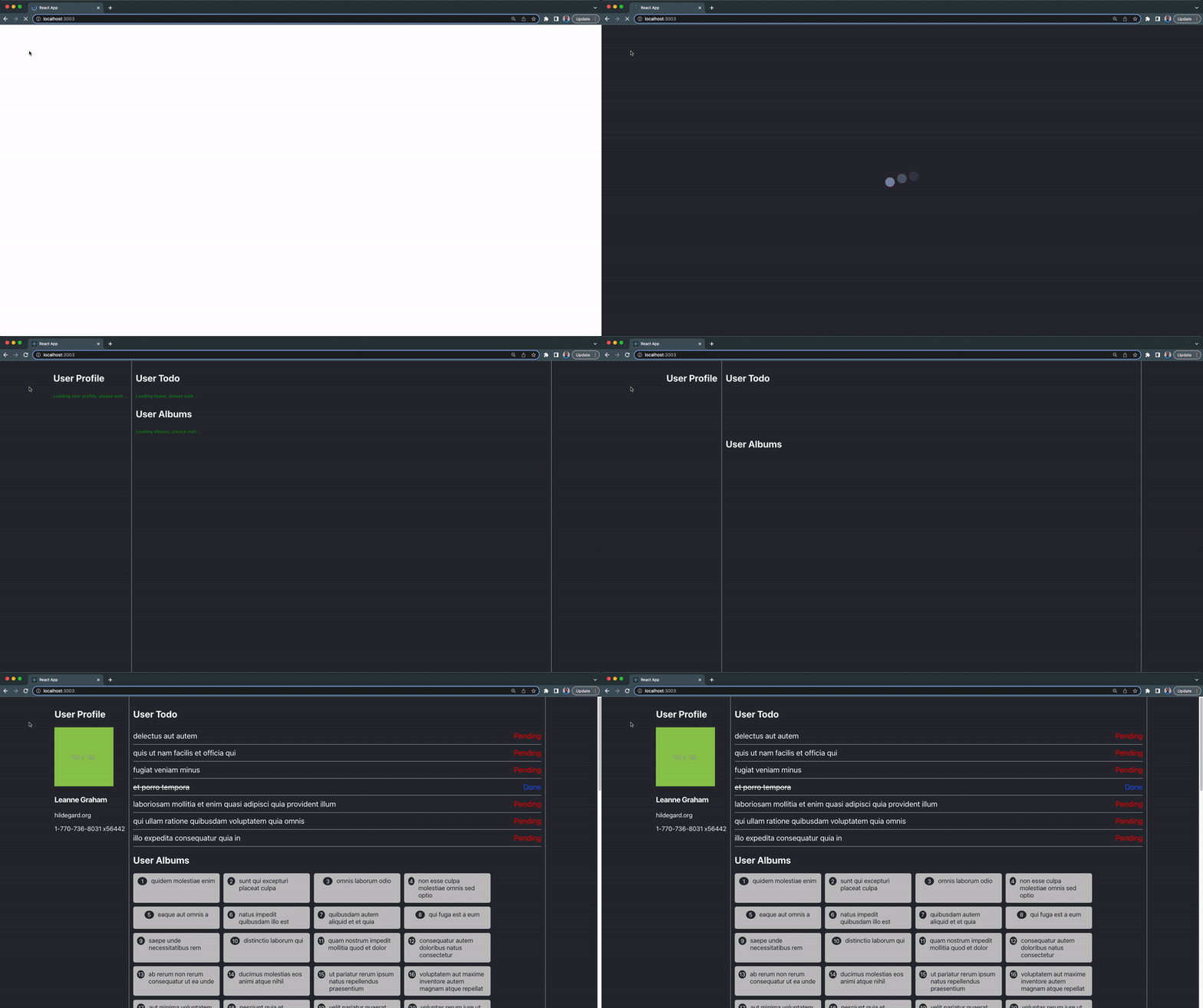
As you can see from the above demonstration
- The App suspense fallback UI (the bouncing loader) is displayed first, followed by the dashboard.
- Then the data fetching suspense component fallback UI (green texts) is displayed until the fetched data from the endpoint and ready to be fully rendered on the UI.
In this section, we’ve seen how React suspense can be used in multiple data fetching components. In the next section, we’ll demonstrate how each error boundary handles the fetching errors.
Step 4 – Testing The Data Fetching Component Error Boundary
In this section, we’ll try to create an error within our data fetching component to trigger their error boundary.
Update the endpoint URL in the UserAlbum component to this:
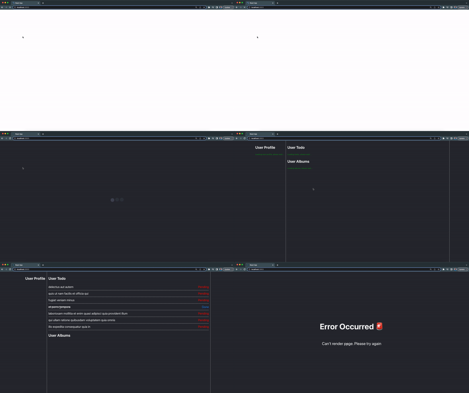
We’re providing an invalid endpoint which will cause an error and break our app. Let’s see how the UserAlbum component error boundary will handle this crash:

rom the above example, when the error occurred, instead of the whole app crashing, the error boundary fallback option of the component will be rendered.
If no error boundary is wrapped around the crashed component, the error will be passed to the nearest top error boundary.
Comment out the error boundary component around the UserAlbum suspense component in the UserDashboard. Our app will have a different error when the UserAlbum crashes:
What does React Suspense lets you do and what does it not?
React suspense may be misunderstood for a variety of concepts or pre-existing solutions; here are some examples of what React suspense can and cannot achieve for you:
- It lets fetching libraries deeply integrate with React.
- It lets you orchestrate intentionally designed loading states.
- It helps you avoid race conditions.
- React suspense is not a data fetching implementation; it makes no distinction between GraphQL, REST, or any other data format, library, transport, or protocol.
- It is not a ready-to-use client like the fetch API and cannot be used in place of fetch
- It does not couple data fetching to the view layer; it merely aids in the presentation of a loading indicator without attaching the network logic to the component.
React Suspense Frequently Asked Questions
Why Do We Use Suspense in React?
Ans: React Suspense is a mechanism for fetching libraries to let React know about a fetching state with an option to render a loading indicator.
What is Race Condition?
Ans: Race conditions are errors that occur in React app as a result of false assumptions about the possible execution order of our code. Race conditions in React frequently occur while fetching data in the useEffect Hook or in the class lifecycle methods like componentdidUpdate. We can solve Race Conditions with Suspense.
Is suspense in React 18?
Ans: Yes, suspense is available in React version 18.
What Is Suspense in React 18?
Ans: Suspense refers to React’s new ability to suspend rendering while components are waiting for something i.e data, and display a fallback UI i.e a loading indicator.
Which React has suspense?
Ans: All React starting from version 16.6 has React suspense.
What is fallback used for in suspense?
Ans: Fallback is a UI that is used as a loading indicator when a component is been suspended in React apps.
Can I use suspense React?
Ans: Yes, you can make use of suspense in your React app, but you should keep a tab with the new releases by the React team.
Is React suspense experimental?
Ans: Yes, React suspense is still experimental, and a few or more things might change in the future.
Is React suspense a data fetching library?
Ans: No, React suspense is not a data fetching library but a mechanism that allows data fetching libraries to communicate to React about a component that needs to be suspended.
How does suspense work in React?
Ans: React suspense will suspend a component until a certain condition is met i.e waiting for network request for data or waiting to be fully ready for render. A fallback UI is rendered during this period.
What’s the difference between React Lazy and Suspense?
Ans: React lazy function allows you to dynamically import a component and render it only when it’s required. While suspense is a component wrapped around react components that display a fallback UI while the component is lazy loaded.
What’s fetch-on-render?
Ans: This is a data fetching approach where data are being fetched within the component useEffect when they mount.
What’s fetch-then-render
Ans: This is a data fetching approach where the data for the next UI is fetched as soon as possible before it can be rendered. An example of fetch-then-render is Relay without Suspense.
What’s render-as-you-fetch
Ans: This is a data fetching approach where the data for the next UI is fetched as soon as possible and the new screen is rendered immediately. This is also referred to as Relay with suspense.
Wrapping Up
In this article, we’ve learned how React suspense and error boundary works, we also explored the React fallback UI and how to implement them in a React application or web app.
You can find the complete source code for this tutorial in this repository.
If you want to learn more about React suspense for data fetching, you should check out the videos below:
If you’re looking out for cool React tools that’ll help you to write component code faster and be production ready faster than your competition, don’t forget to check out the CopyCat plugin for React!
Happy Coding!
Interesting Reads From Our Blog:


 "
"
